Lumé Skin Studio
The brand that lives on her wall.

Esthetician Branding · Illustrated Brand Mark · Service Menu Design
The Brief
Sofia Marini had built something rare.
Three years in. Fully booked. A waitlist growing entirely through word of mouth — because her results spoke before she ever did.
Her signature treatment — a 90-minute barrier repair facial — was producing the kind of skin that clients photographed, talked about, and referred their closest friends for.
But her brand looked like she'd started yesterday.
A Canva logo. An inconsistent Instagram. A service menu that listed treatments alphabetically next to prices — designed to be compared, not experienced.
She was charging $185 for a treatment worth $275.
And every time she tried to raise her price, she hesitated.
Because her brand didn't support the number yet.
The Challenge
The gap between Sofia's work and her brand was costing her — not in clients, but in confidence.
She was fully booked at the wrong price point. And no amount of results or referrals was going to close that gap until her brand caught up with her expertise.
Three things needed to change:
✦ A visual identity with genuine authority
Not a refresh. A complete rebuild — from a brand system that looked like it belonged in an editorial feature on the best facialists in Nashville.
✦ A service menu built around conversion
Not a price list. A strategic experience that led every reader toward The Lumé Ritual — her highest-value treatment — without a single moment of comparison shopping.
✦ A brand mark that was genuinely unforgettable
The kind of visual identity element that clients don't just notice — they photograph it, frame it in their minds, and talk about it before they've even had their treatment.
The Illustrated Brand Mark
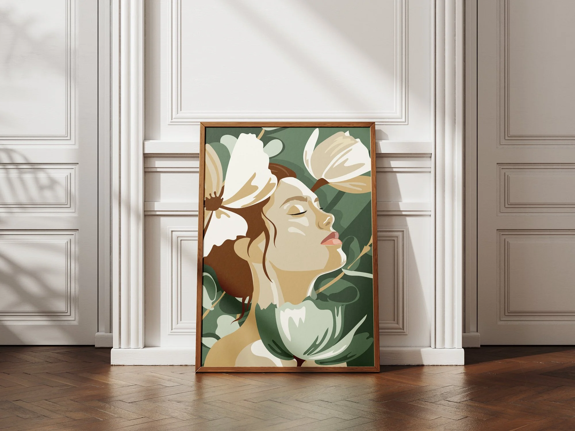
This is the piece that changes everything.
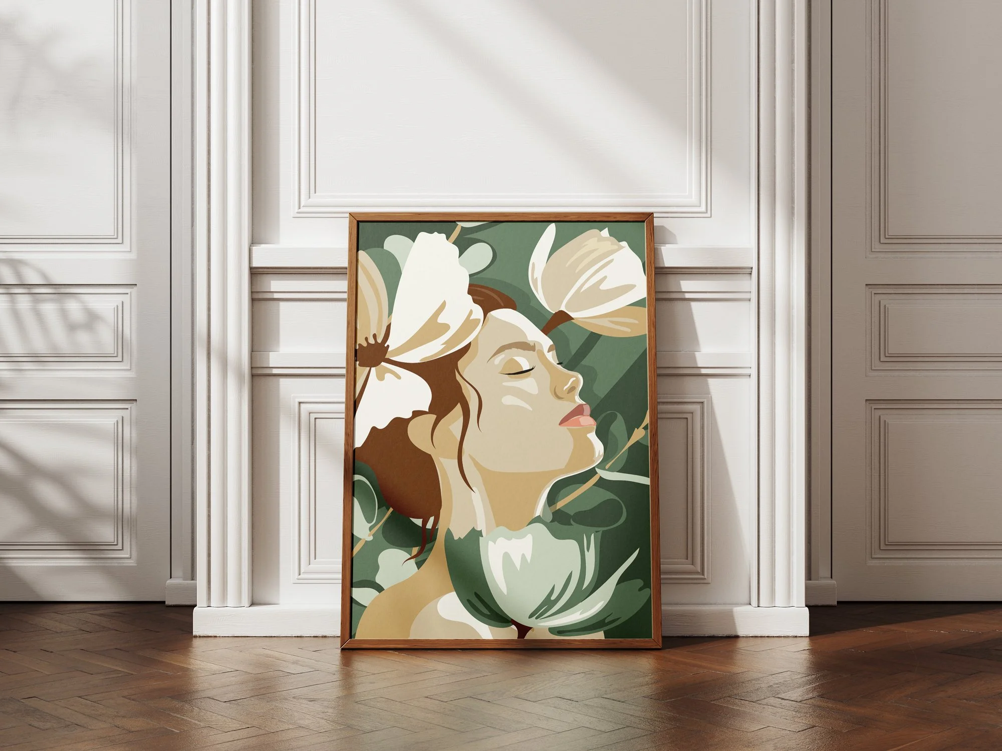
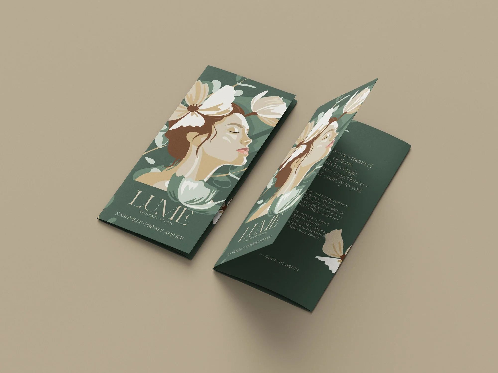
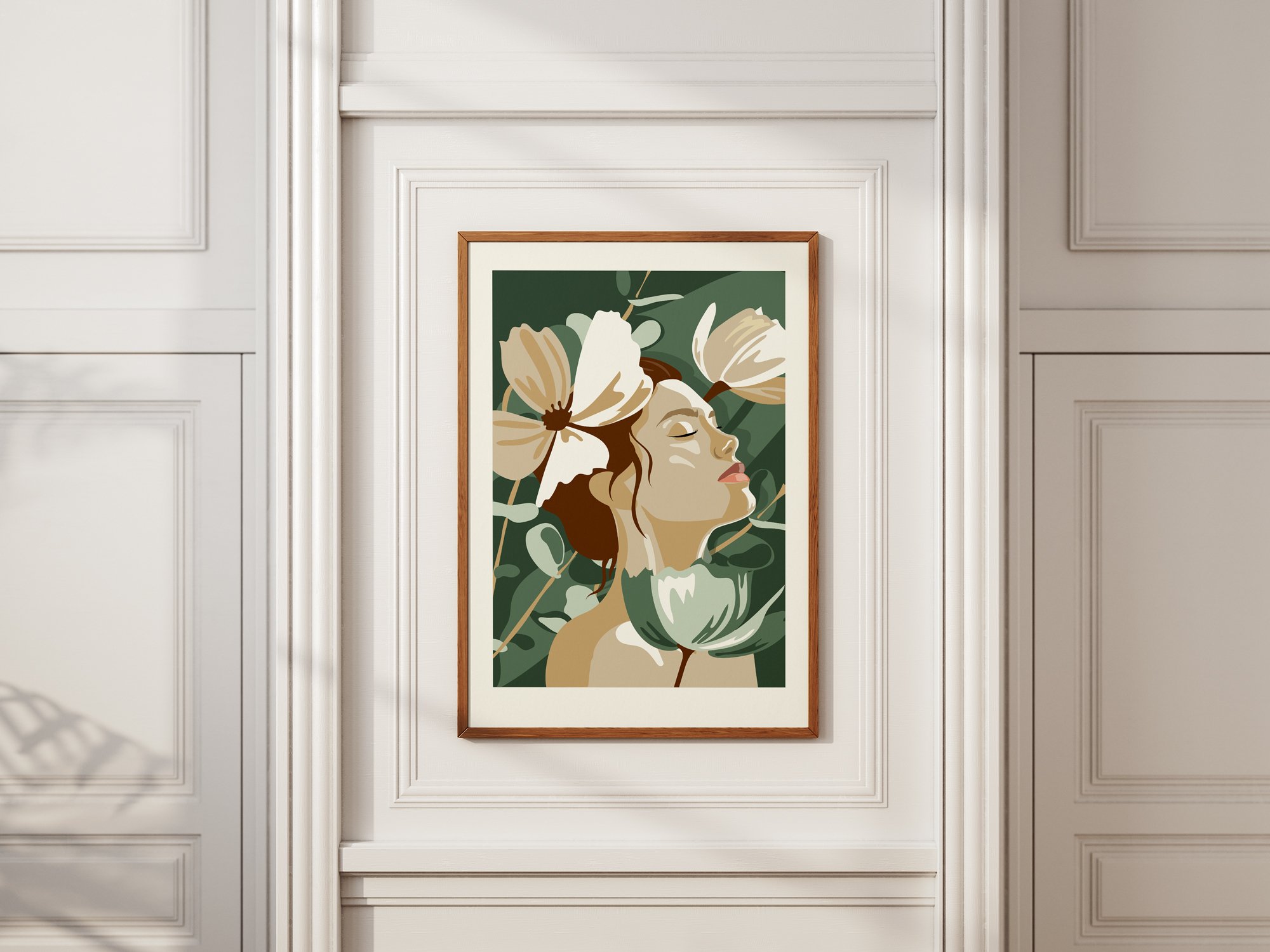
A woman in profile — head tilted, eyes closed, the expression of someone completely at rest. Around her, magnolia blooms rendered in warm cream and tobacco brown against deep forest green. Bold. Painterly. The kind of artwork that belongs in a gallery — and now belongs in a treatment room.
This is not a logo with a decorative element added.
This is original fine art — created exclusively for Lumé Skin Studio.
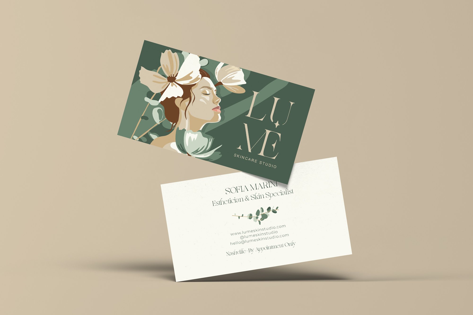
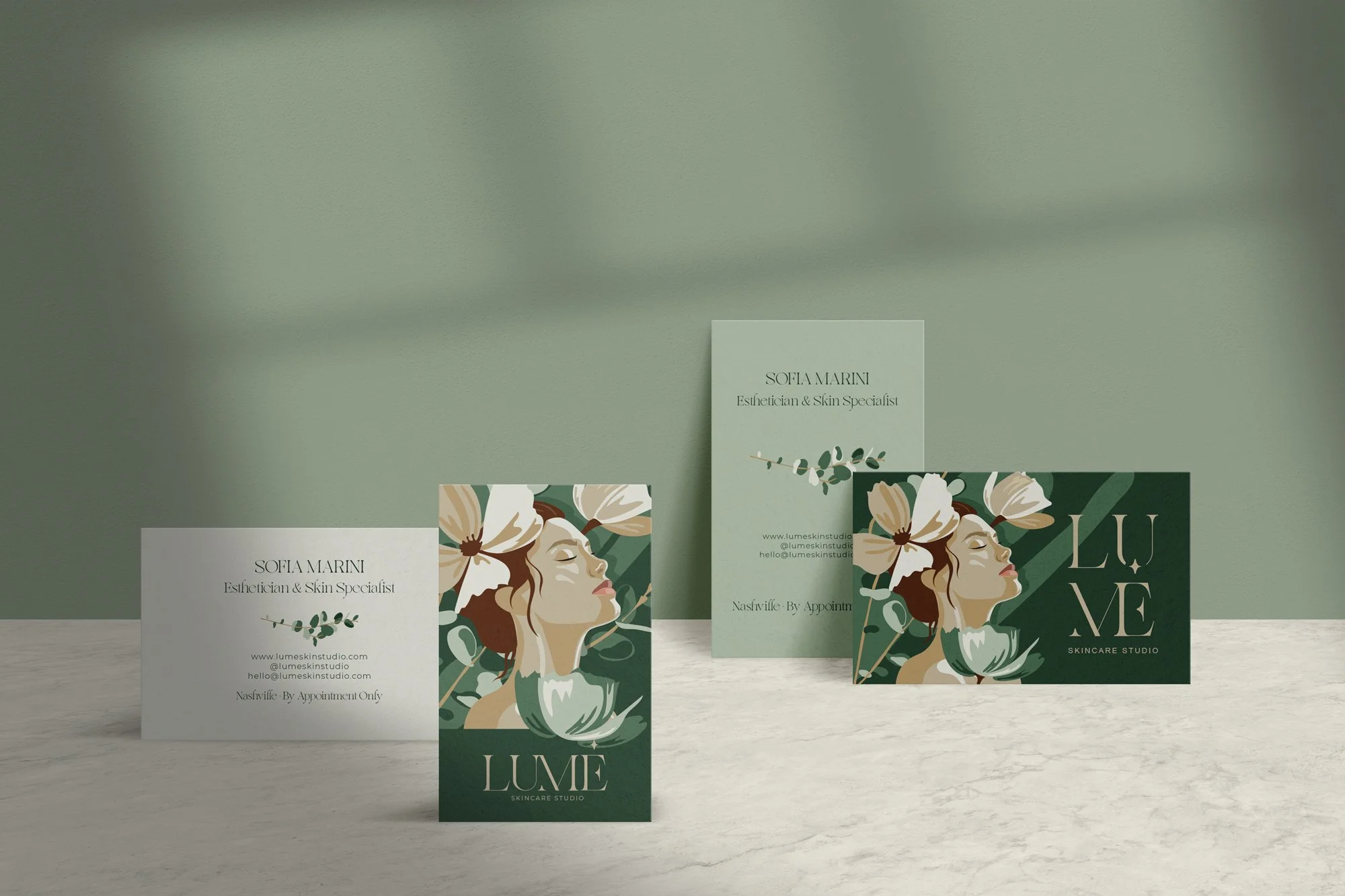
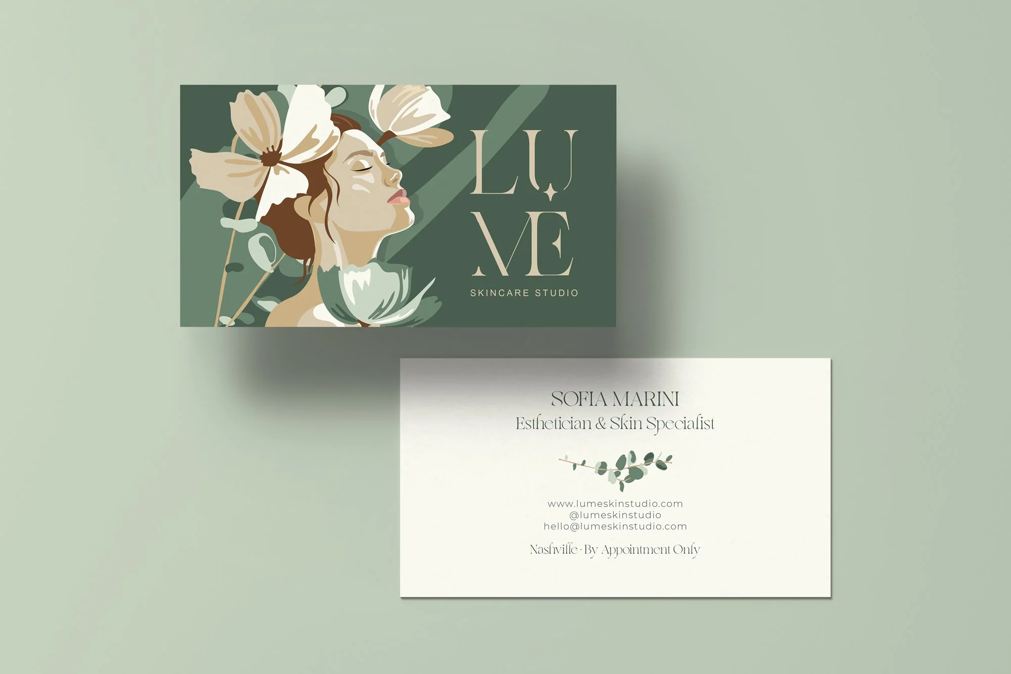
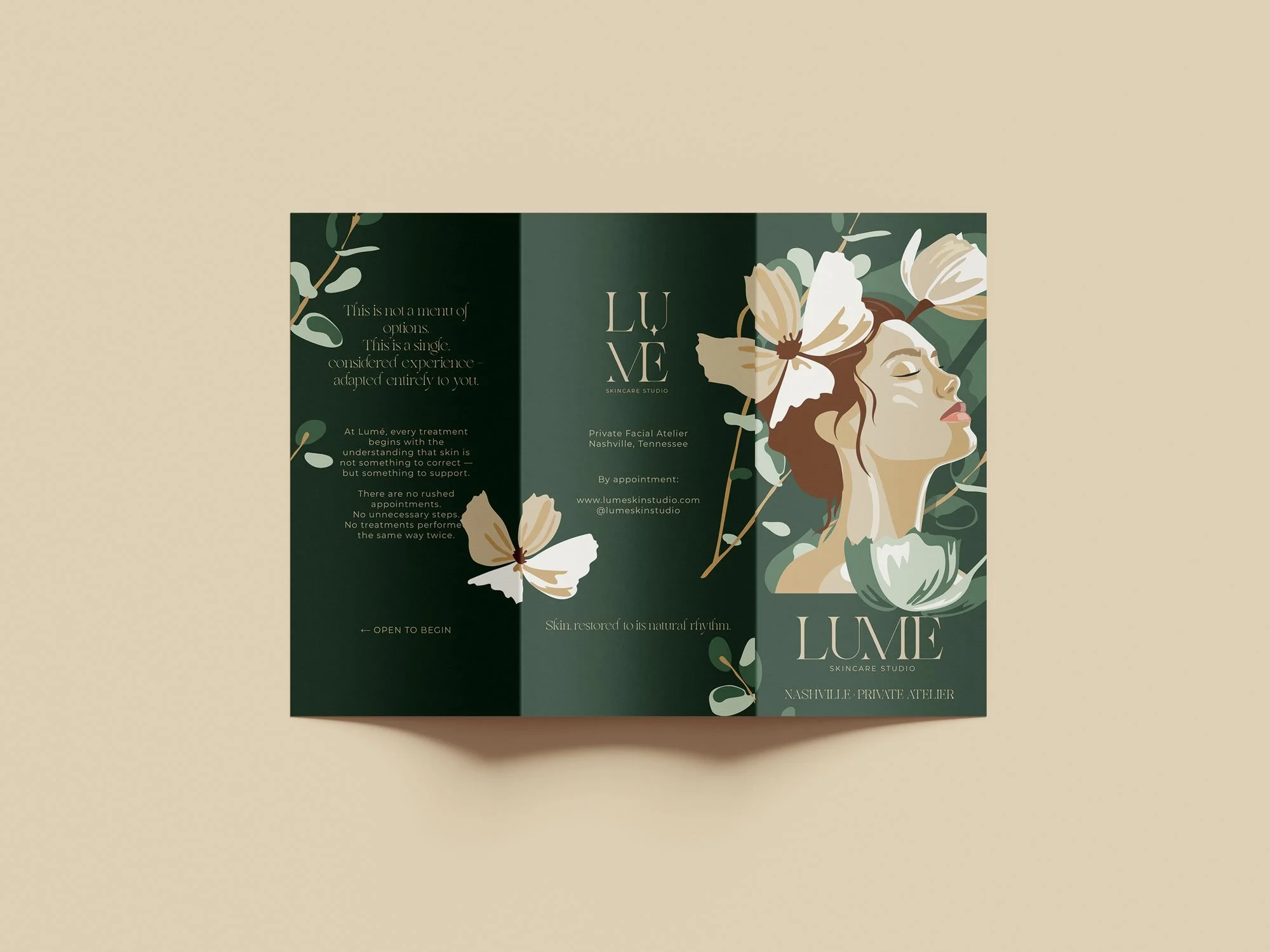
It lives on the brochure cover. The treatment room wall — framed, lit, the first thing a client sees when she walks in. Her Instagram. Her packaging. Her business card.
It is the thing her clients photograph without being asked.
The thing they ask where they can buy a print of.
The thing that makes Lumé Skin Studio impossible to forget — and impossible to copy.
There is no other brand in Nashville that looks like this.
That was the brief. That is the result.
The Visual Direction
The entire brand was built around one strategic decision — Lumé should feel like the opposite of the clinical skincare world.
Where most esthetician brands reach for clean white and sterile blue, Lumé needed to feel like a private atelier. Warm. Considered. Rooted in nature, not in a lab.
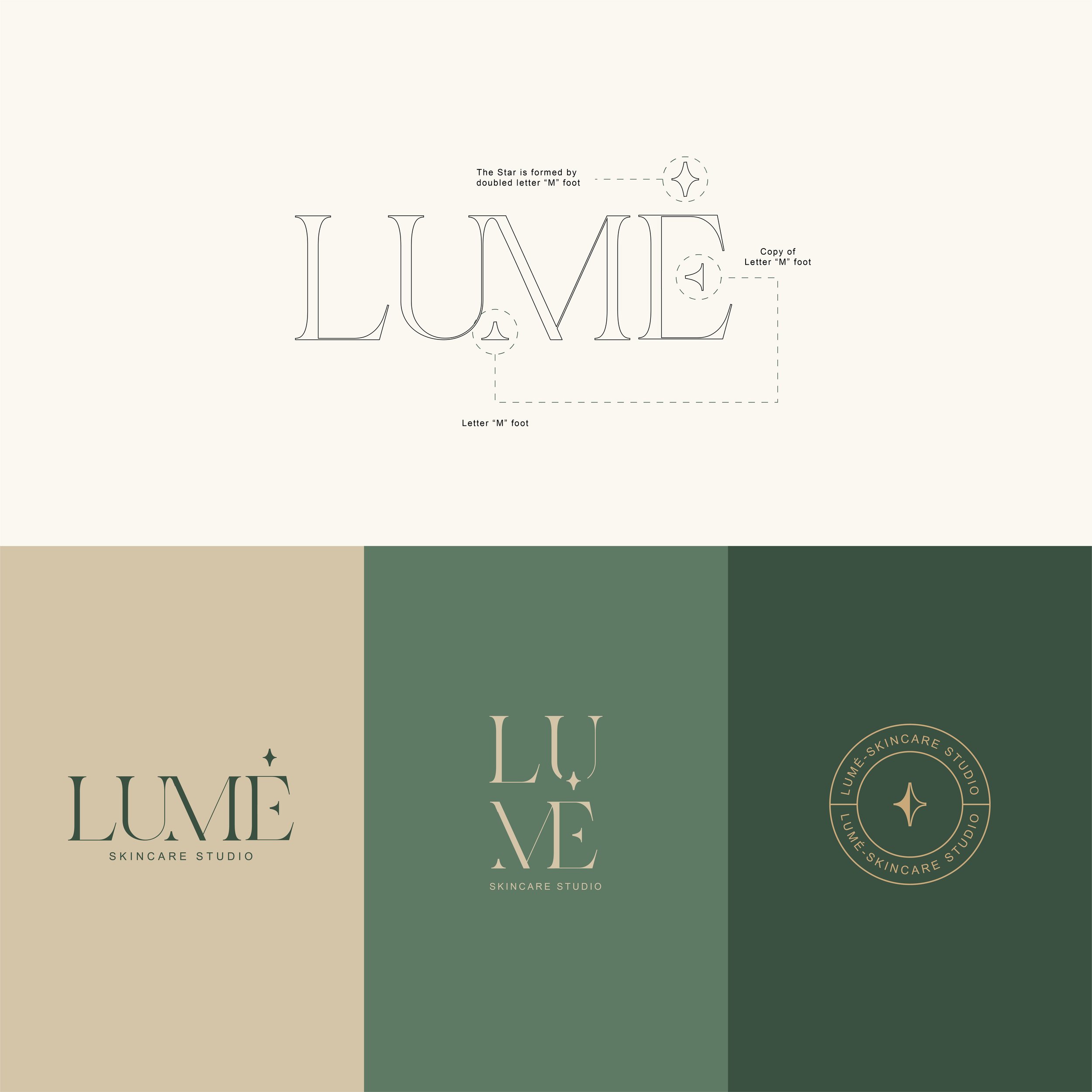
The wordmark is built on a high-contrast editorial serif — refined, feminine, with the quiet authority of a brand that has nothing to prove.
But the detail that makes it unforgettable is hidden in plain sight.
✦ Primary logo— LUMÈ horizontal with the star mark floating above, "Skincare Studio" in wide-tracked small caps beneath. The everyday brand voice.
✦ Secondary logo — Editorial, sculptural, confident. Built for packaging, menu headers, and mid-scale applications where the wordmark needs more visual weight.
✦ Submark — Built for small scale — tissue paper, wax seals, favicon, embossing — where the wordmark loses legibility but the brand still needs to be present.
The star mark appears in all three. Each time, it reveals itself differently. That is what makes a logo system — not three versions of the same thing, but three expressions of one idea.

✦ Floral White
The brand's negative space. Not cold white — a warm, organic off-white that feels like linen, like clean skin, like something natural.
✦ Ash Grey
The quiet tone. A muted, botanical grey-green — used sparingly for backgrounds, secondary text, and breathing room.
✦ Soft Fawn
The warmth. A golden, skin-adjacent tone that brings humanity into the palette.
✦ Pale Oak
The texture tone. Warmer and softer than Soft Fawn — used for backgrounds and layering.
✦ Deep Teal
The mid-tone anchor. A dusty, botanical green that bridges the warmth of the neutrals and the depth of Granite.
✦ Granite
The dominant brand color. Deep forest green — authoritative, enveloping, rooted.
This palette was not chosen for trends.
It was chosen to last — and to work as hard in five years as it does today.
The Service Menu

The original menu listed every treatment alphabetically with prices beside them.
This is the most common — and most costly — menu design mistake in the beauty industry. When a client reads a list with prices, she shops. She compares. She chooses the least expensive option that sounds like enough.
The redesigned Lumé menu does the opposite.
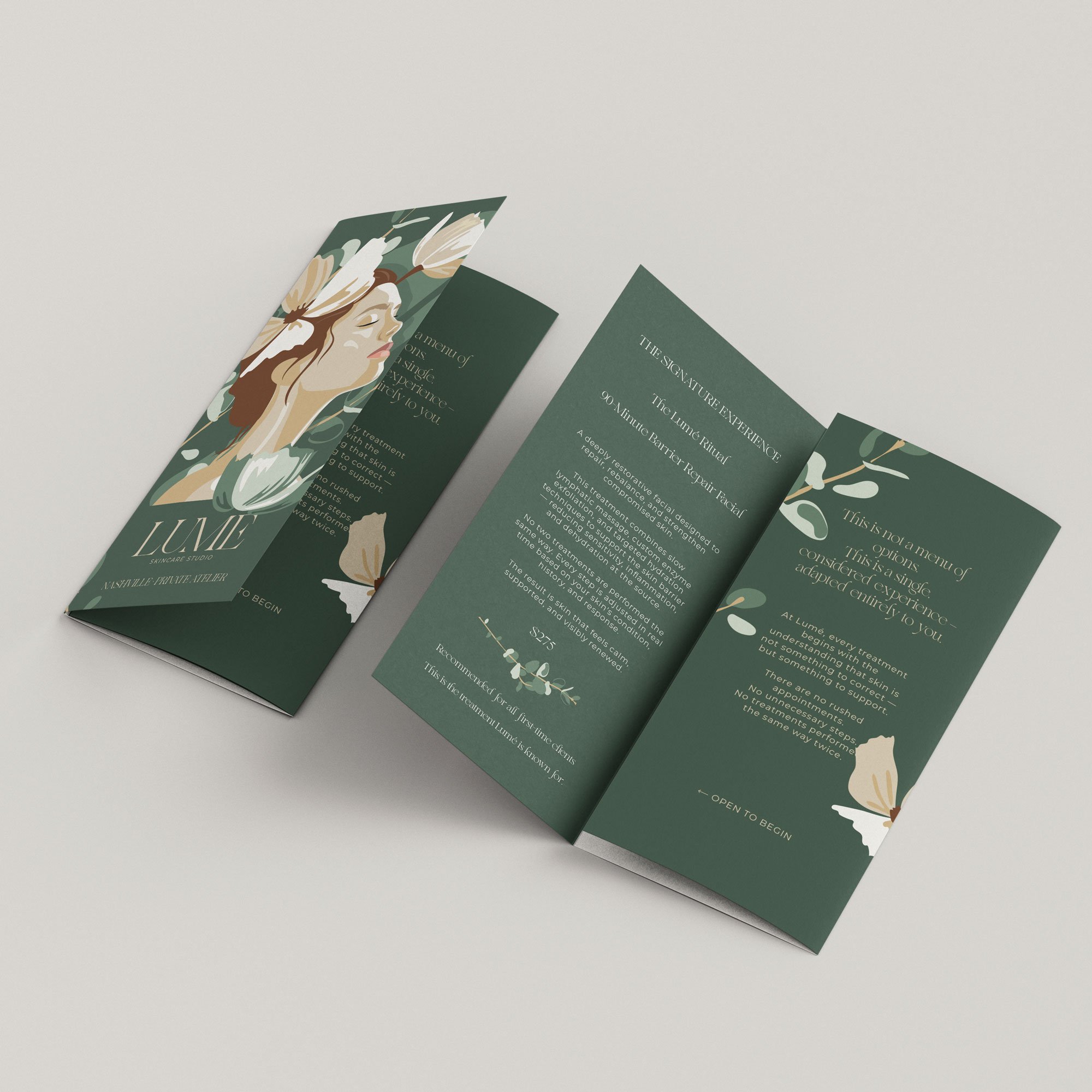
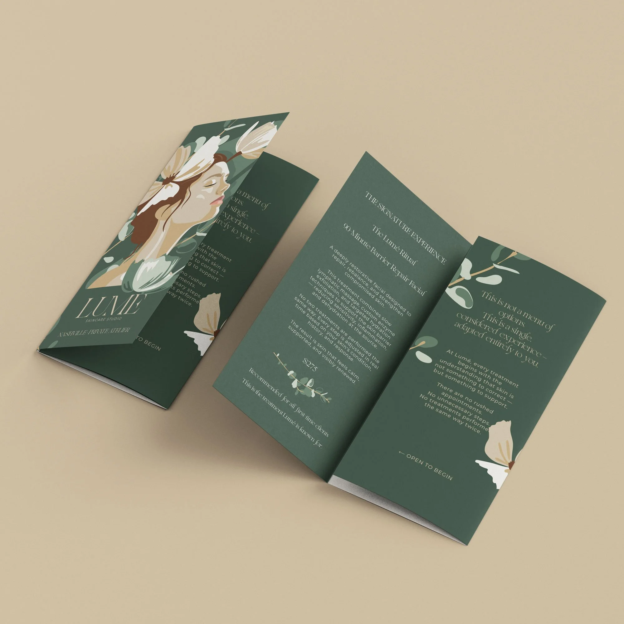
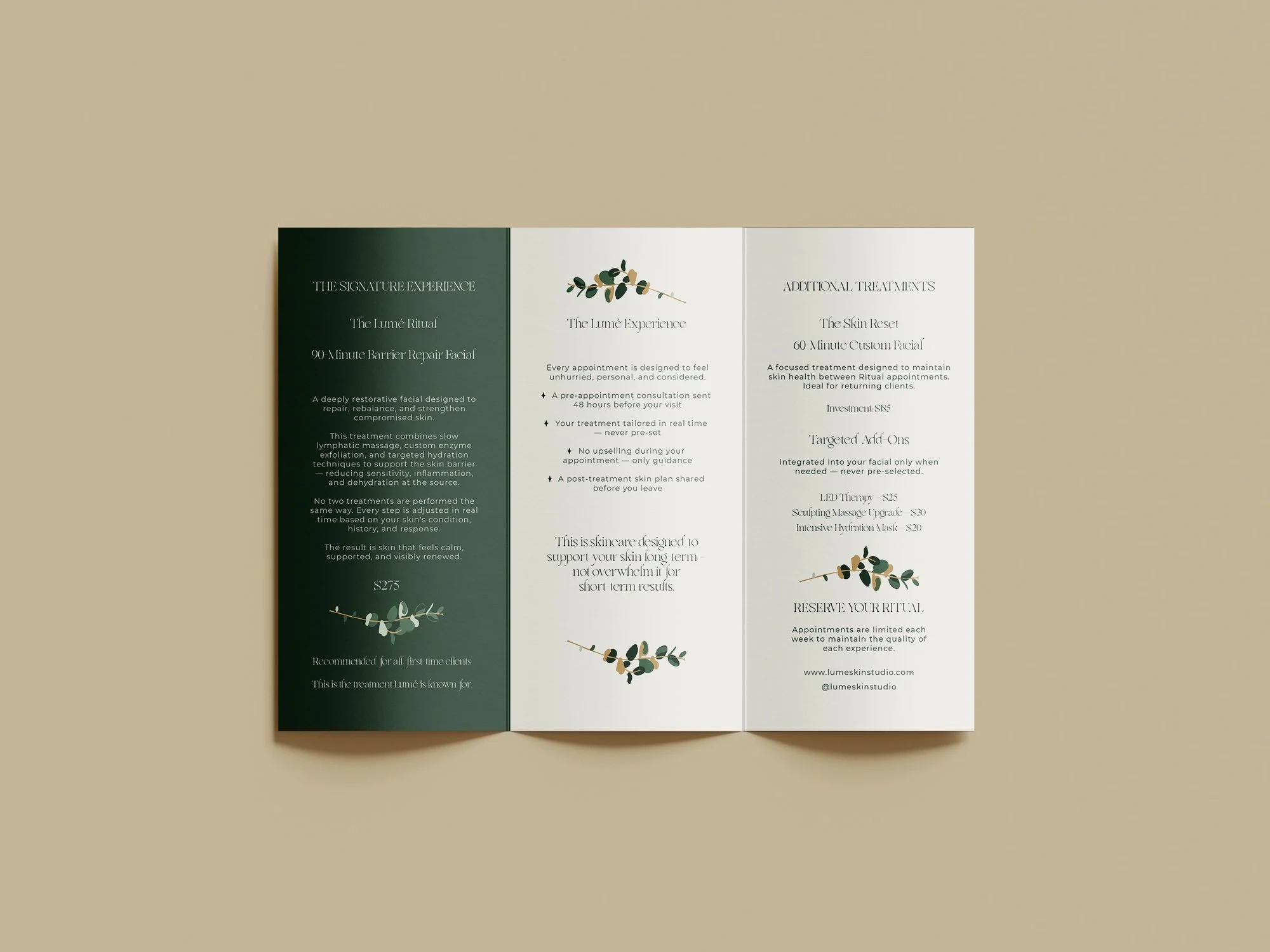
✦ It leads with The Lumé Ritual — the signature 90-minute experience
✦ It describes the feeling before it names the price
✦ It positions every supporting treatment as secondary — not competitive
✦ It replaces the language of choice with the language of guidance
The trifold format was chosen deliberately. The cover opens to reveal the illustrated mark at full scale — the brand experience begins before she reads a single word. By the time she reaches the service description, she is already in the world of Lumé.
When a potential client reads this menu, she doesn't ask "which should I choose?"
She asks "when can I come in?"
The Results
✦ Price Supported
The rebrand gave Sofia the visual authority to raise her signature facial from $185 to $275 — without losing a single existing client. The brand now supports the number before she says a word.
✦ Brand Remembered
The illustrated brand mark became the most photographed element in her treatment room within the first week of launching. Clients began asking where they could purchase a print.
✦ Menu Performing
The redesigned service menu eliminated comparison shopping and increased bookings for The Lumé Ritual specifically — exactly as the strategy intended.
Deliverables
What Was Delivered
✦ Primary logo — wordmark in refined serif
✦ Secondary logo — stacked lockup
✦ Submark — monogram mark
✦ Full color palette with usage rules
✦ Typography pairing
✦ Brand style guide — complete multi-page PDF
✦ Trifold signature service menu — print PDF, digital JPEG, social slides
✦ Original illustrated brand mark — painterly botanical portrait
✦ Complete file package — AI, EPS, PDF, PNG, JPG
✦ Brand board
Your brand should feel like your best treatment.
Let's build it.
If you're fully booked, undercharging, and ready for a brand that finally reflects the quality of your work — The Beauty Ritual was built for you.