

brand identityBrand Identity for SPA &Beauty Center
"Where Relaxation Meets Radiance."
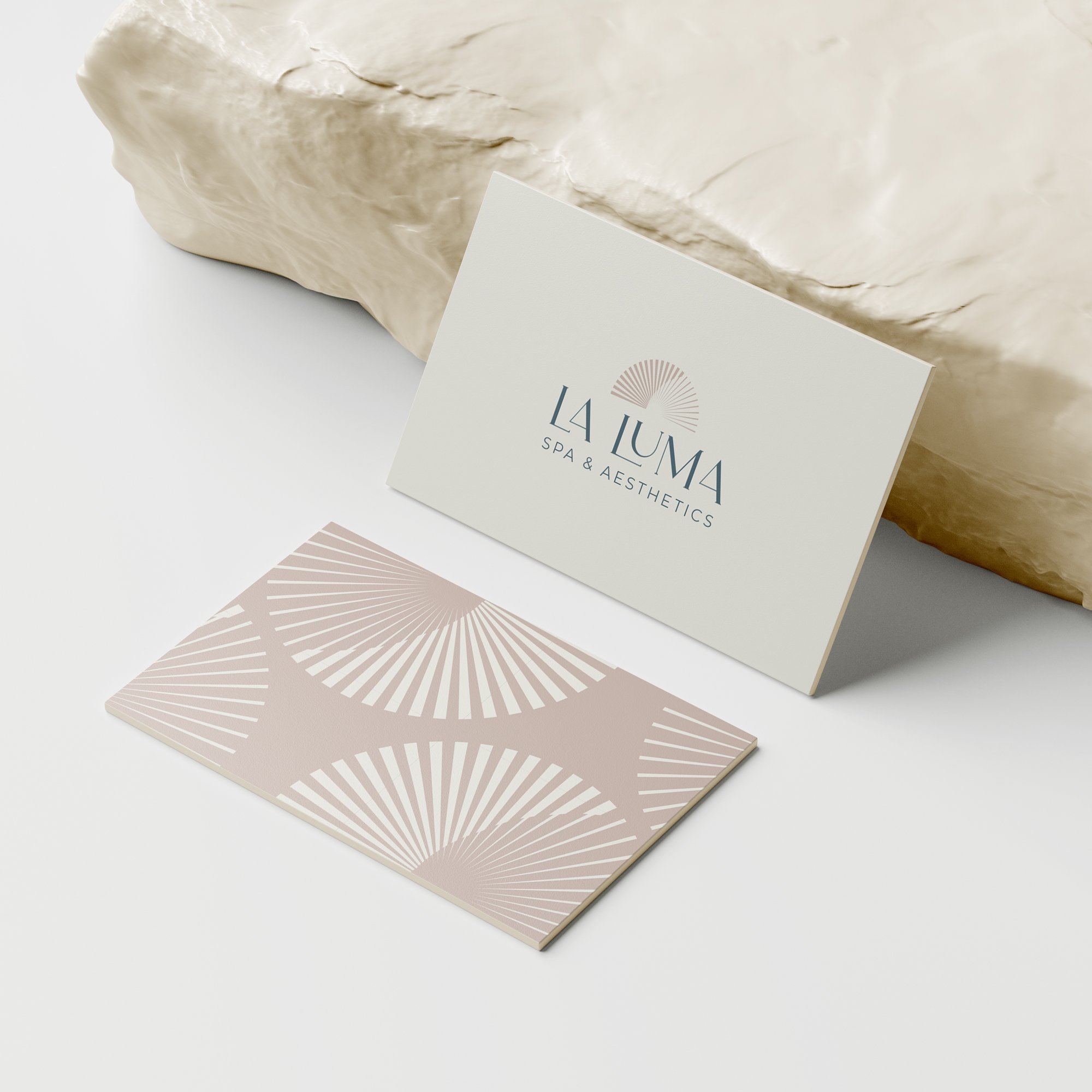
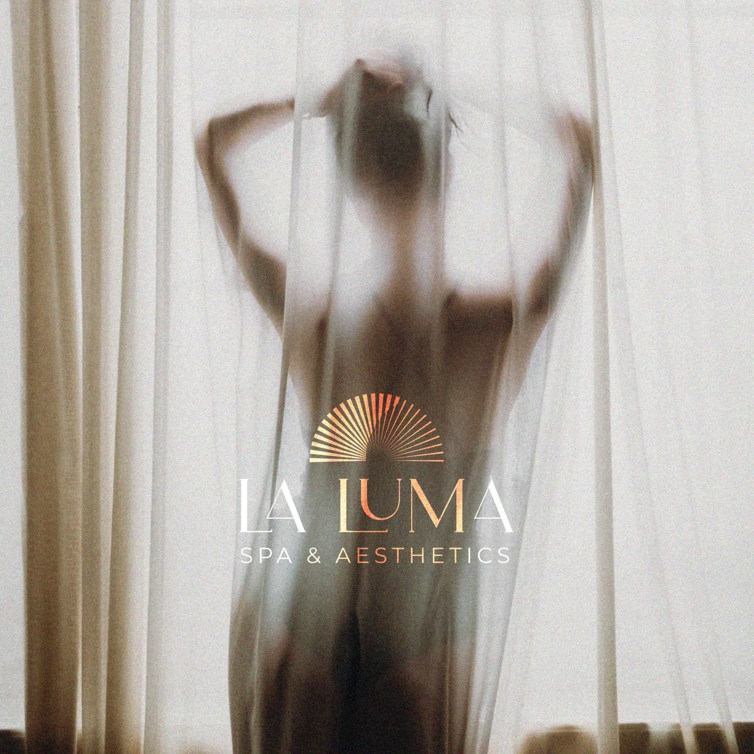
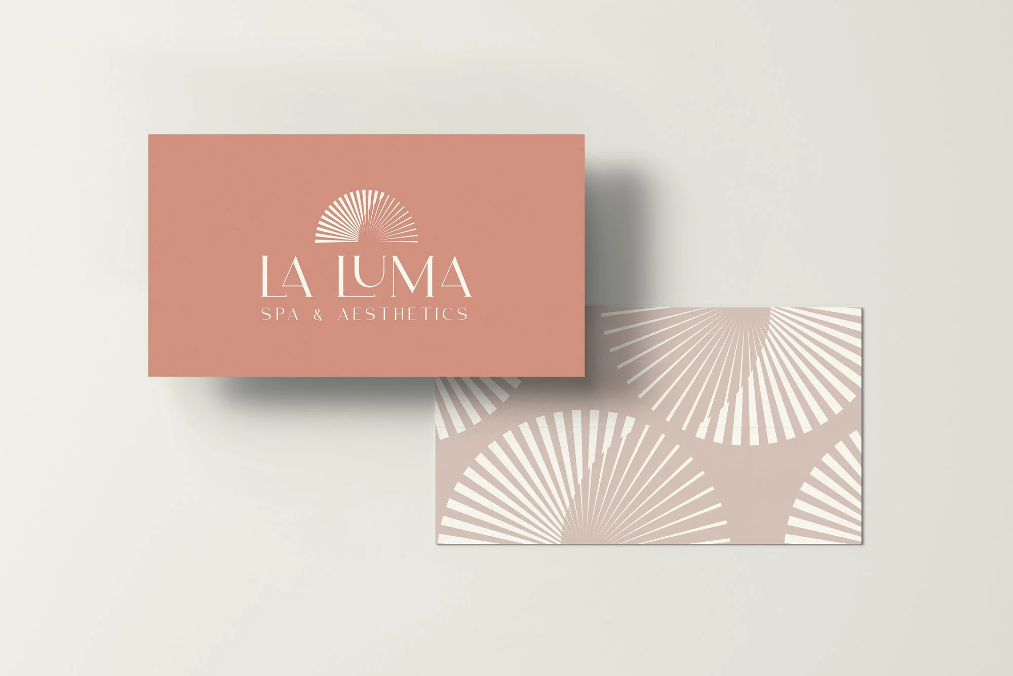
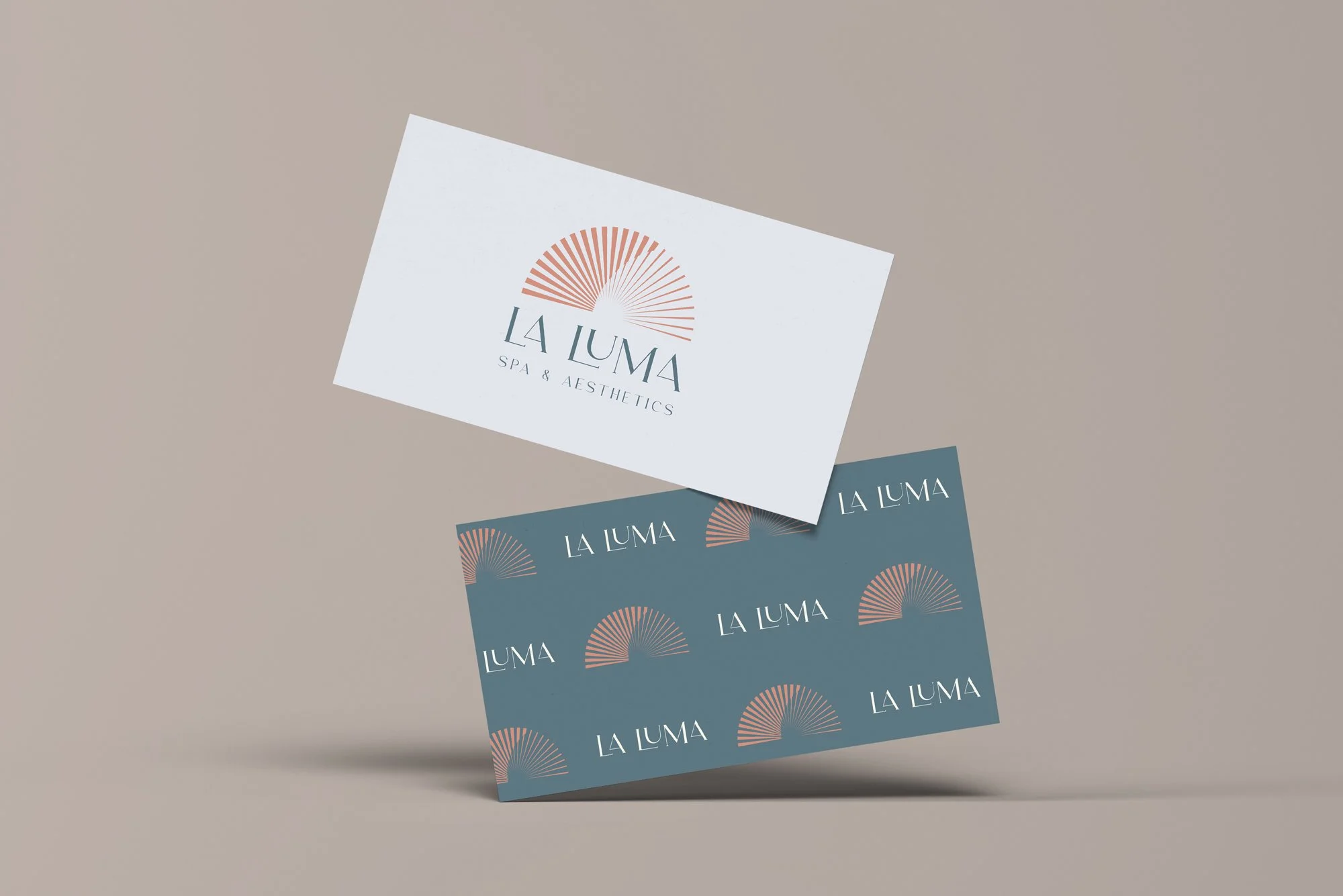
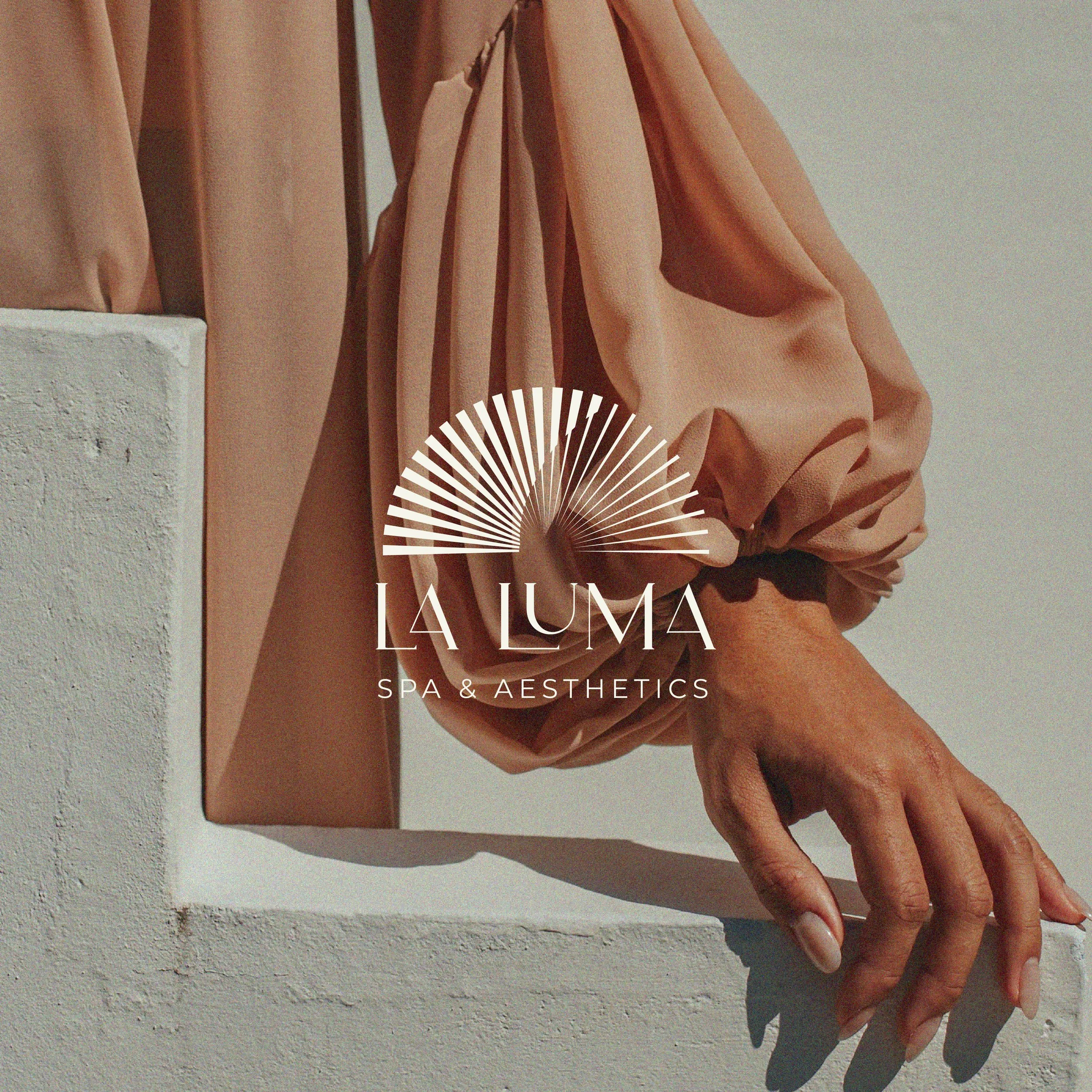
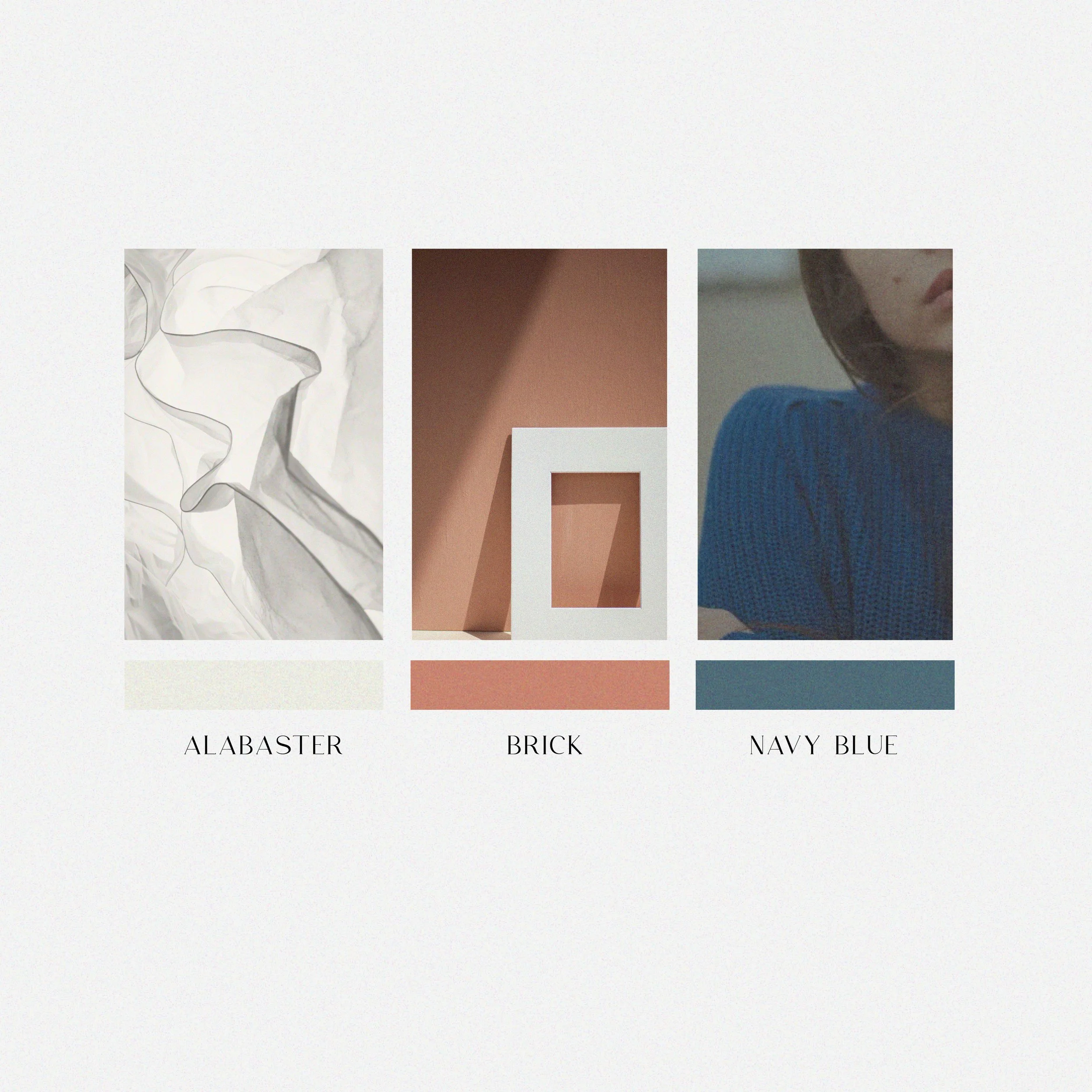
The brand identity of La Luma centers on a serene, minimalist aesthetic that reflects both the natural world and a sophisticated sense of wellness. The palette is calming and grounded, evoking a sense of organic luxury and timelessness, ideal for creating a tranquil and welcoming spa environment.
Typography is clean and modern, featuring a clear sans-serif font that conveys professionalism and approachability.
Tone of Voice is gentle, warm, and expert, using language that is clear and reassuring.
Brand Words
Elegance, Renewal, Harmony
Drop me an email at itsdianadesign@gmail.com
Wanna get in touch?
Follow my journey on Instagram @itsdianadesign


