SCULPT & SILK
High-End Branding for Estheticians: From Solo Facialist to Signature Ritual Authority
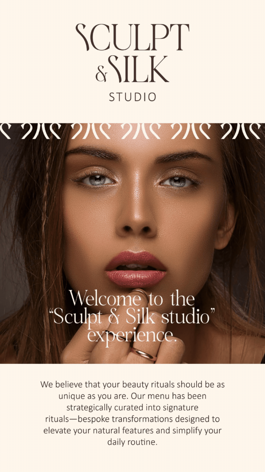
This 10-Day Beauty Brand Identity was designed to provide premium positioning for a solo esthetician, transforming Sculpt & Silk into a results-driven studio built around exclusive treatment rituals.
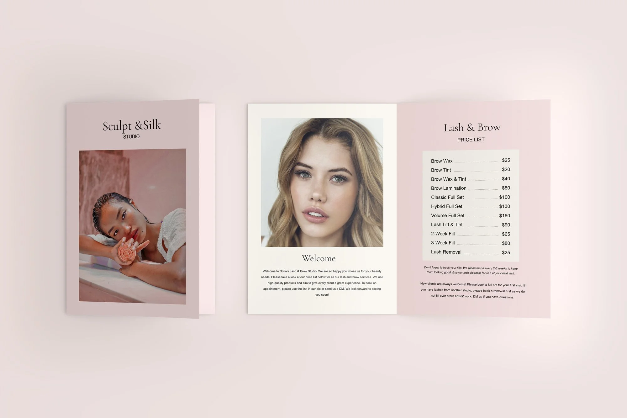
Before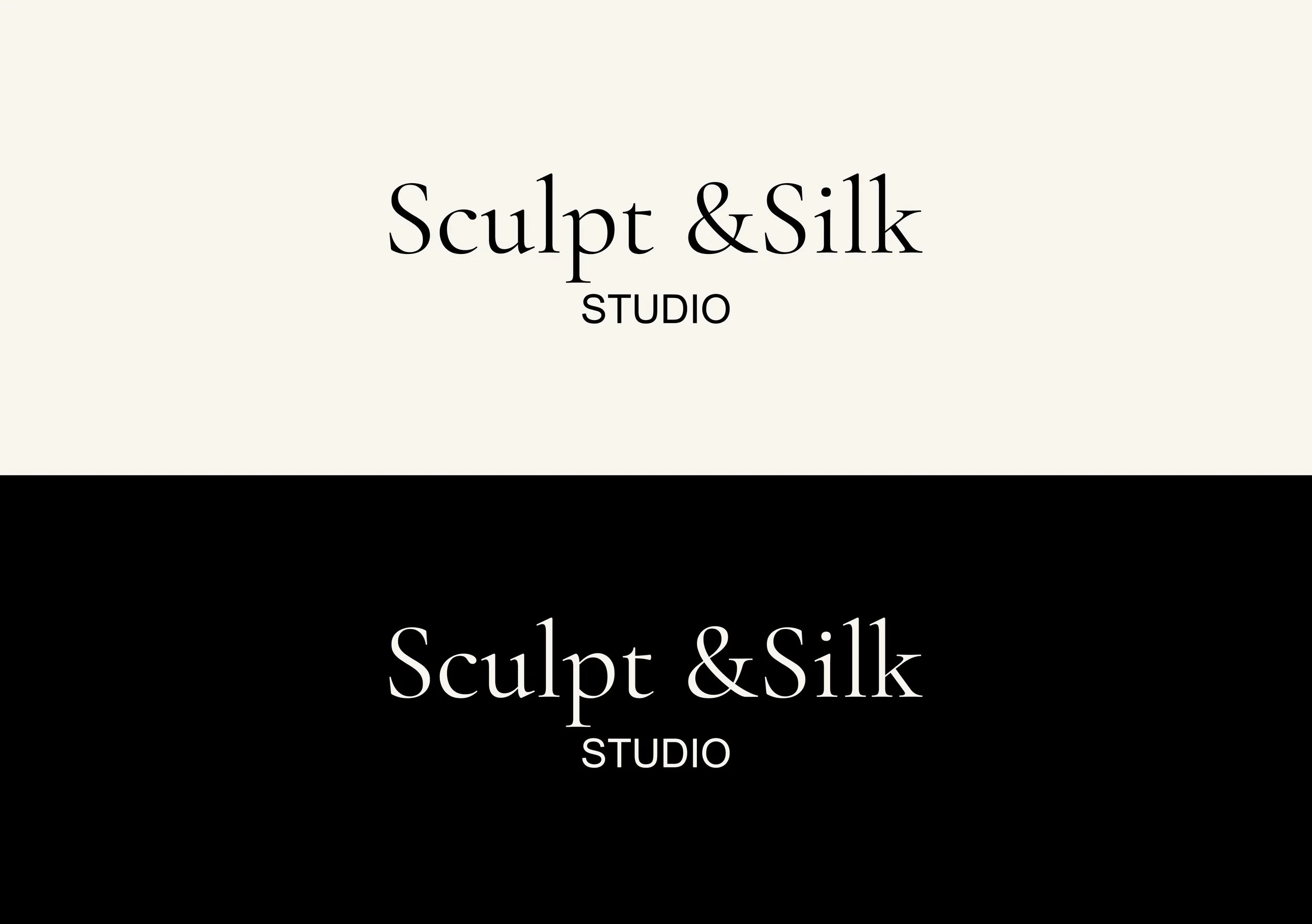
THE PROBLEM
As a talented solo beauty founder, Sculpt & Silk had the skill—but her visual identity didn't reflect her high-end expertise.
Her services felt like generic skincare treatments rather than a luxury experience.
Her service menu design looked like a basic price list, making it hard to justify premium rates.
Without a clear "hero" service, she was competing with every other local facialist on price.
after
THE BRANDING STRATEGY
Instead of just a logo design, we focused on brand strategy for beauty professionals. The goal was to pivot from a generalist to a specialist.
The "Pioneer" Move:
We built the entire brand around a Signature Service Category: “The Signature Rituals.” This moved the business from selling "facials" to selling an exclusive, branded beauty experience.

“The Signature Rituals”
This reframed the services from basic treatments into:
intentional
exclusive
experience-driven
higher-value
Rather than selling services, Sculpt & Silk now sells rituals with a result and identity.
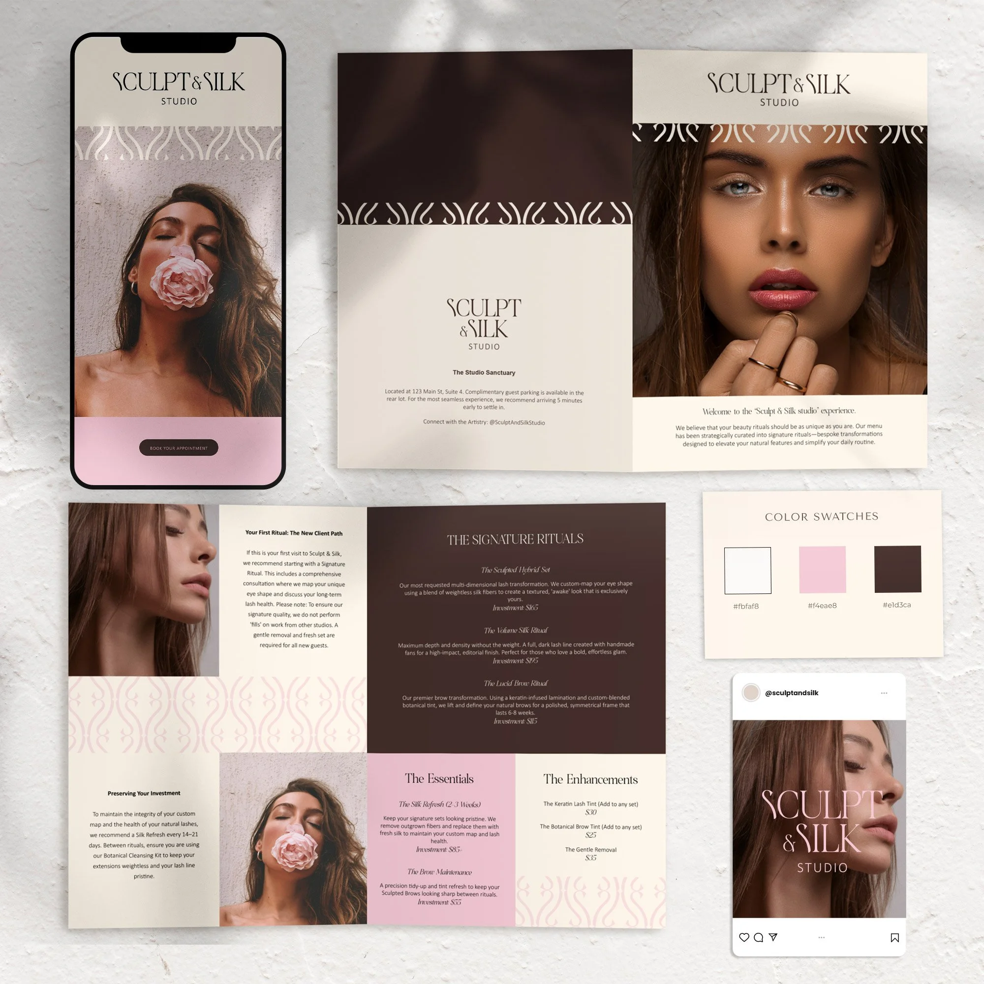
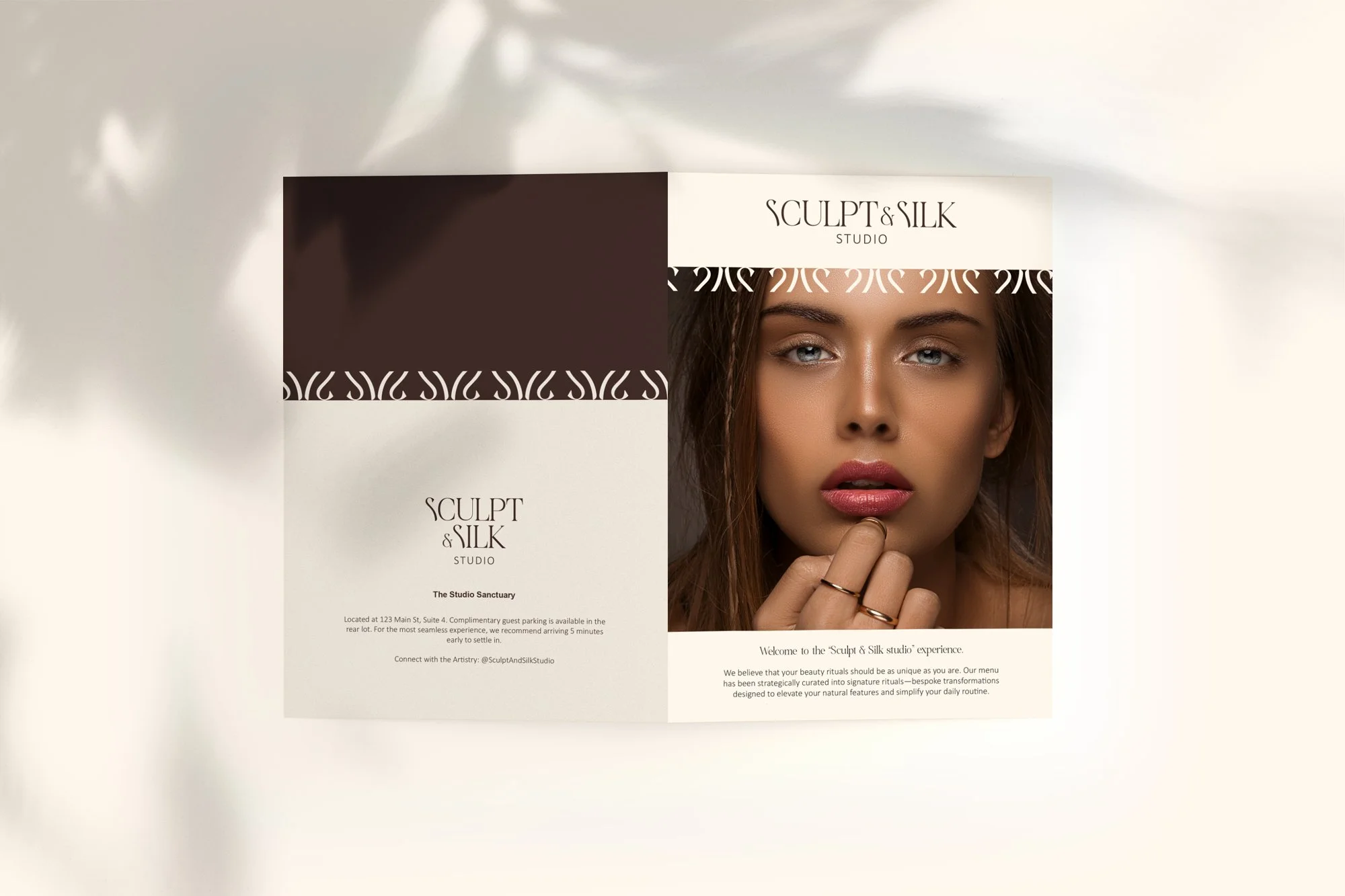
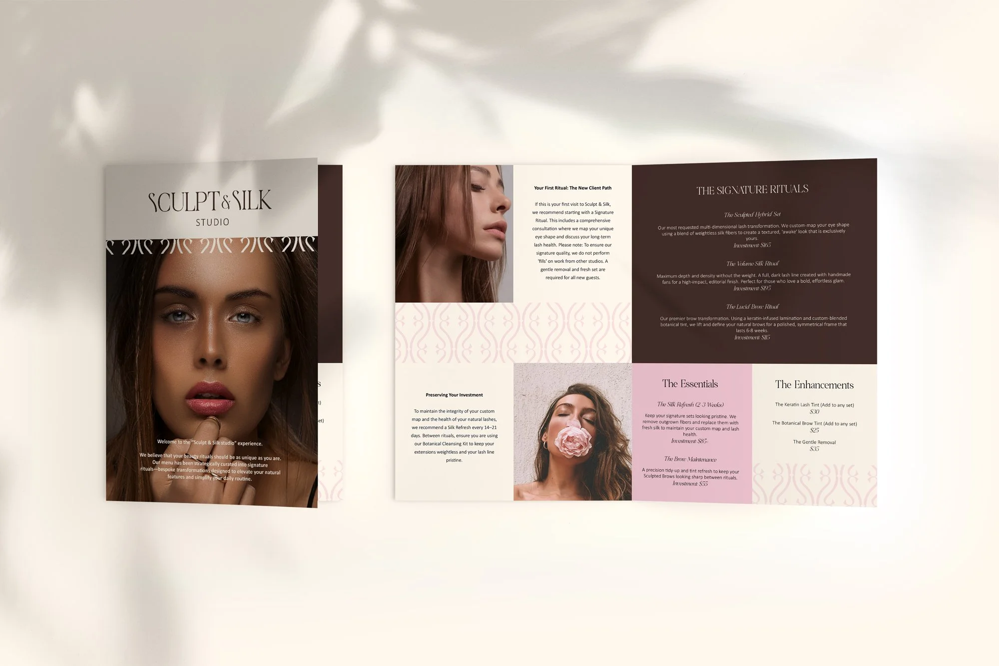
THE VISUAL IDENTITY SYSTEM
The identity was designed to balance soft femininity with structured luxury.
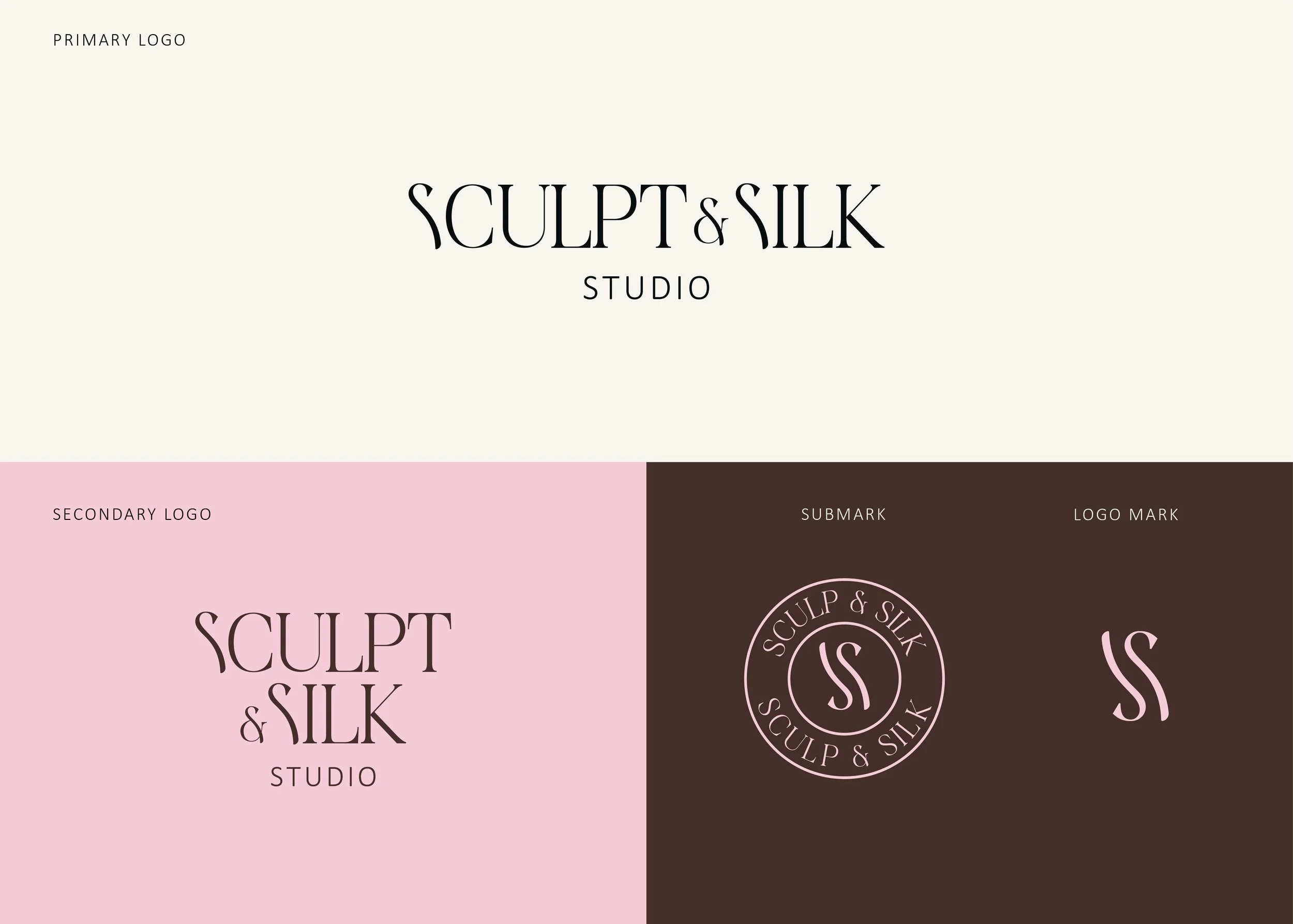
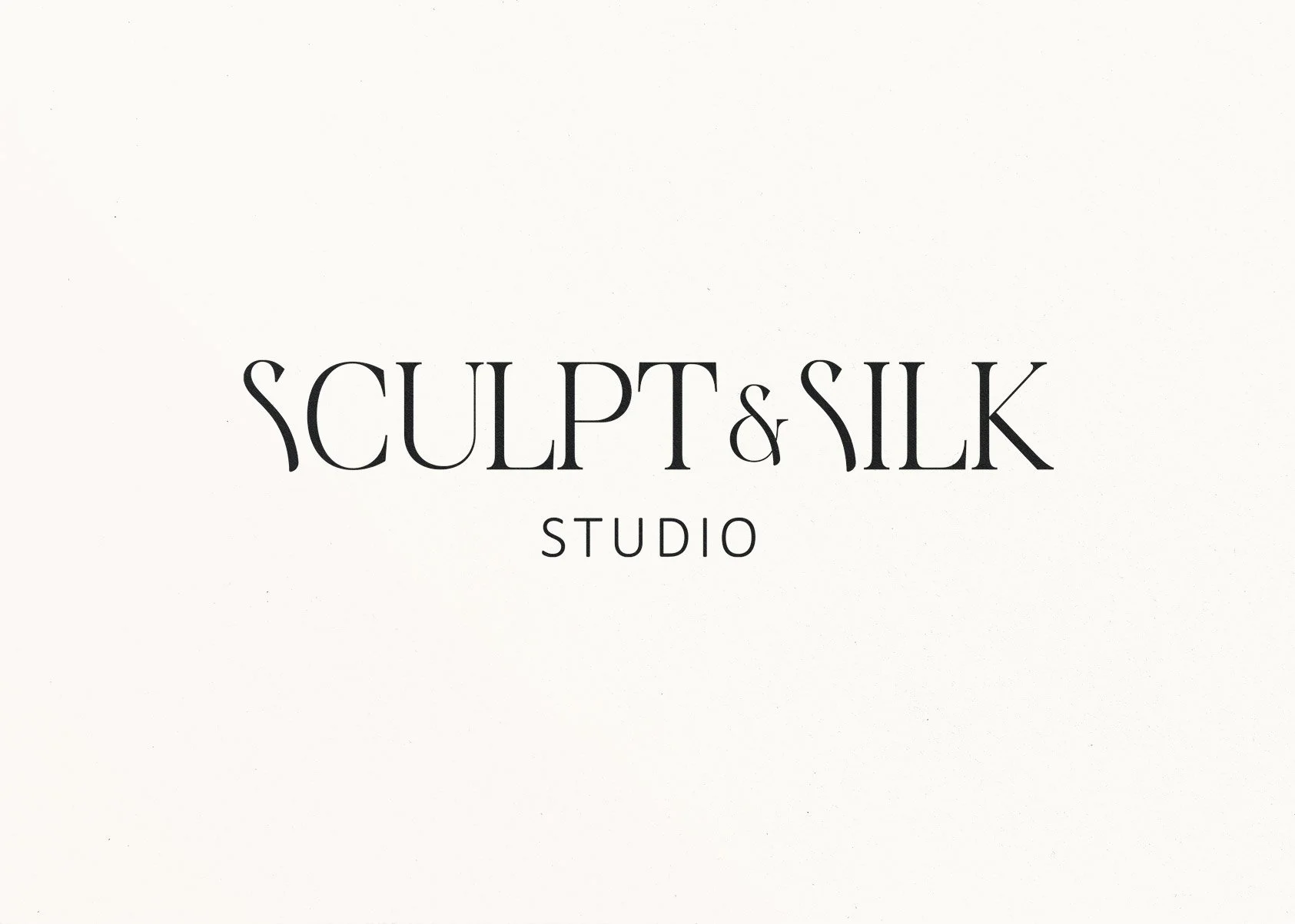
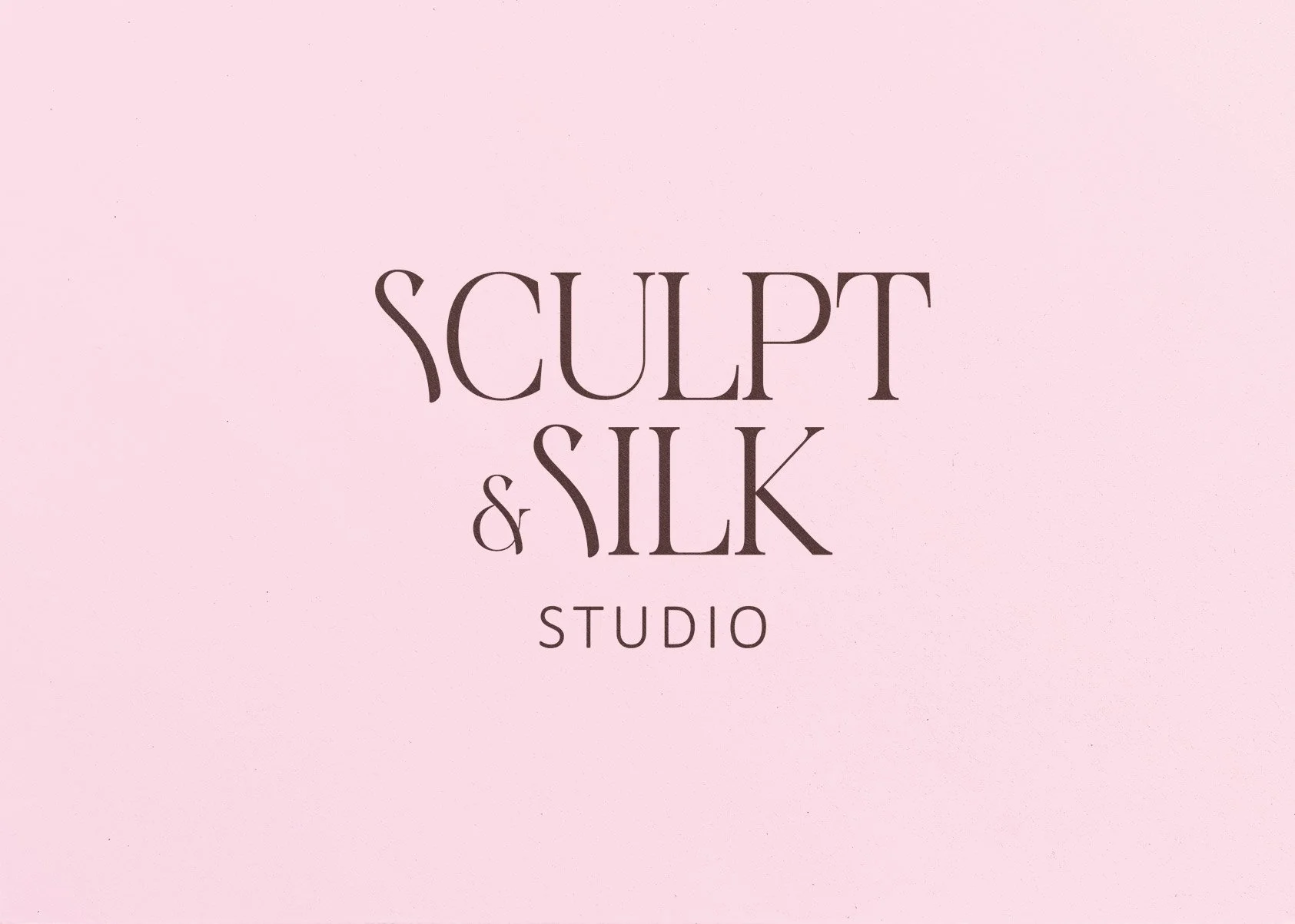
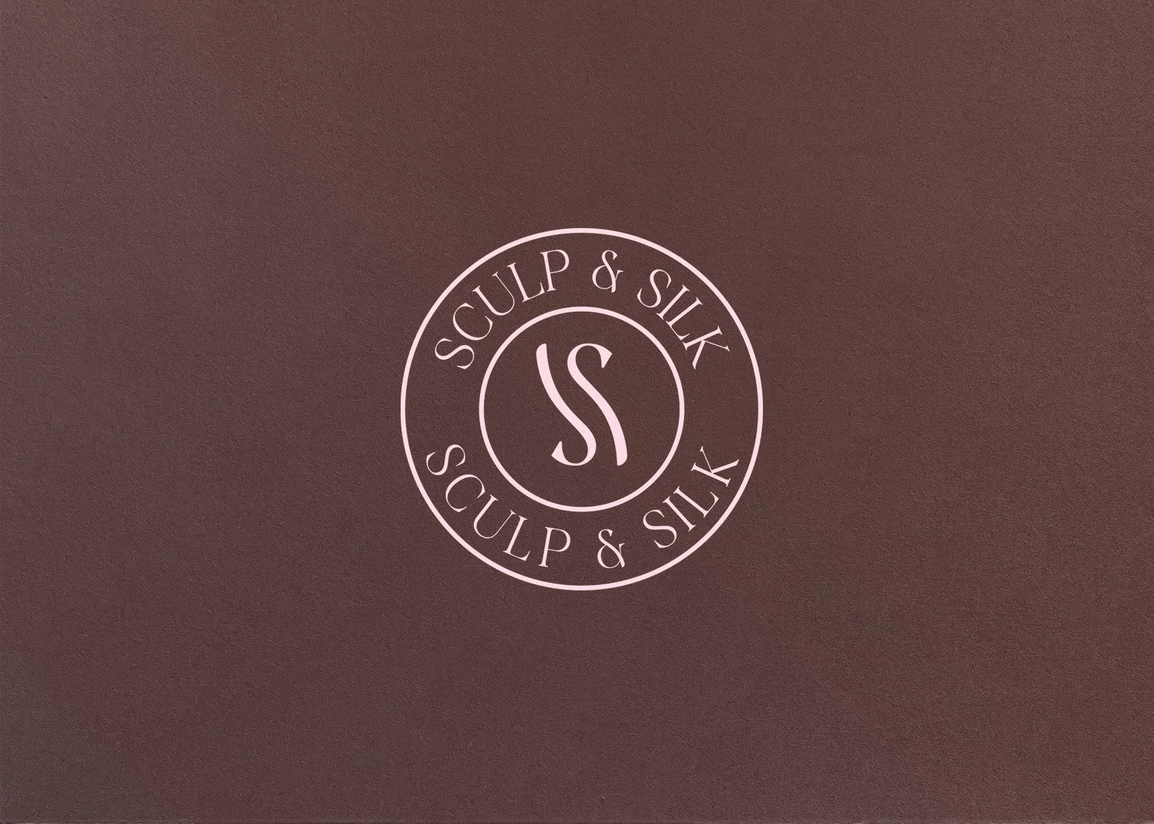
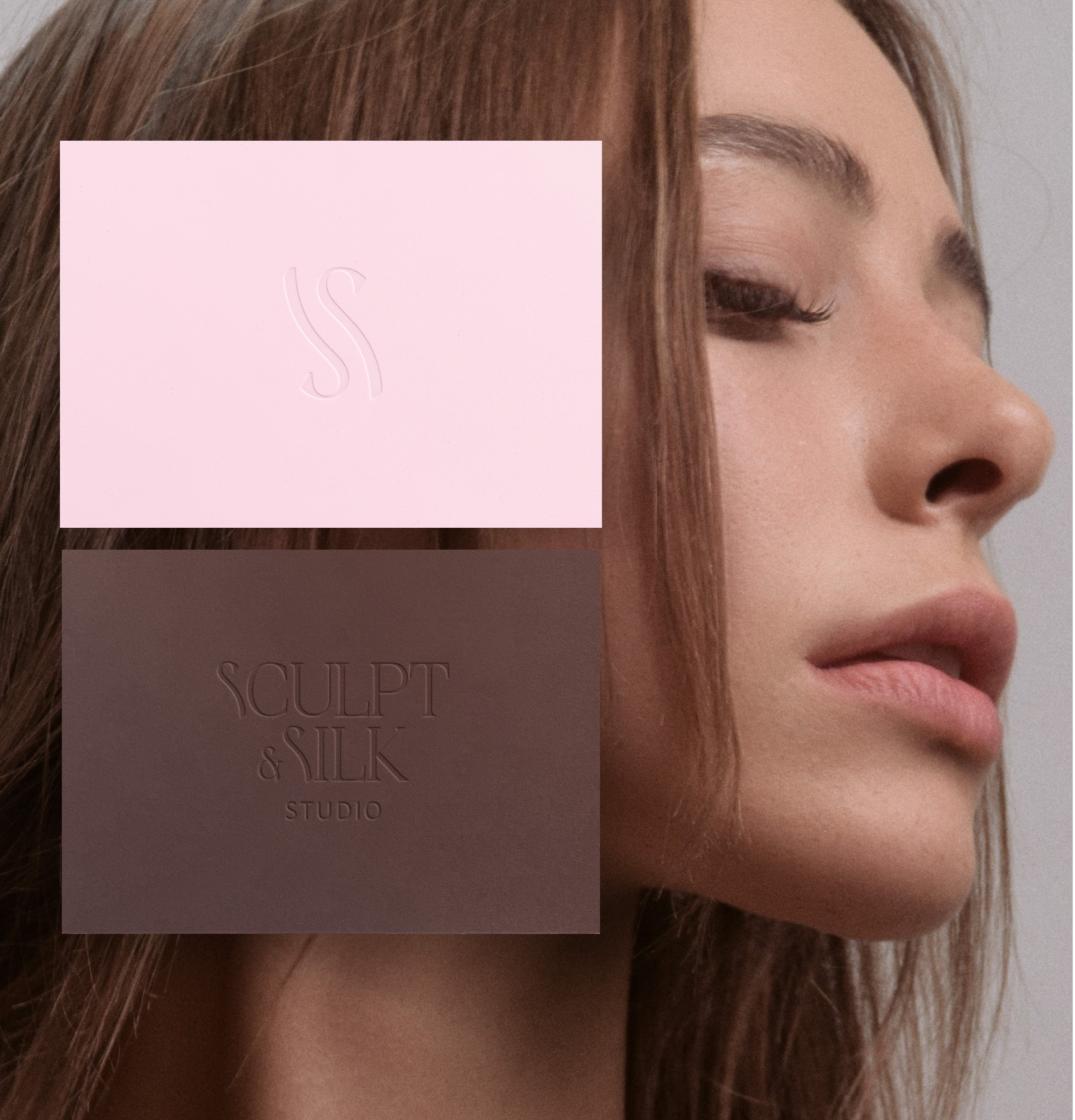
Logo System
A refined serif logotype paired with a monogram and stamp-style mark:
communicates authority + elegance
flexible across digital and print
feels editorial and timeless
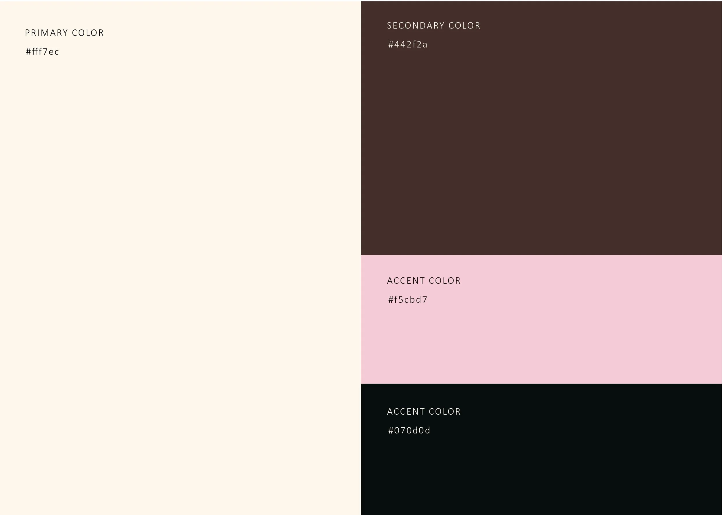
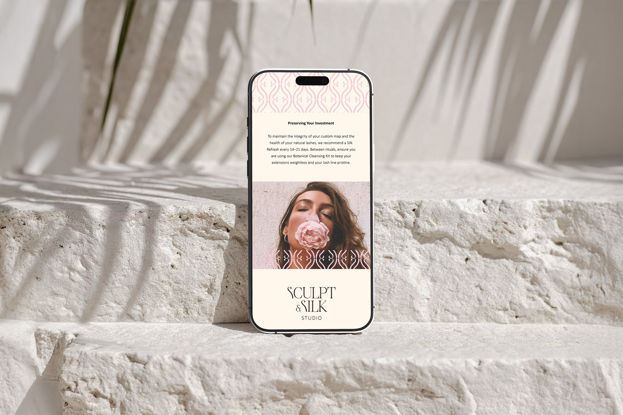
Color Palette
A curated mix of:
soft nude + blush tones → skin, softness, femininity
deep brown + near-black → depth, luxury, grounding
This contrast creates a brand that feels both:
approachable and premium
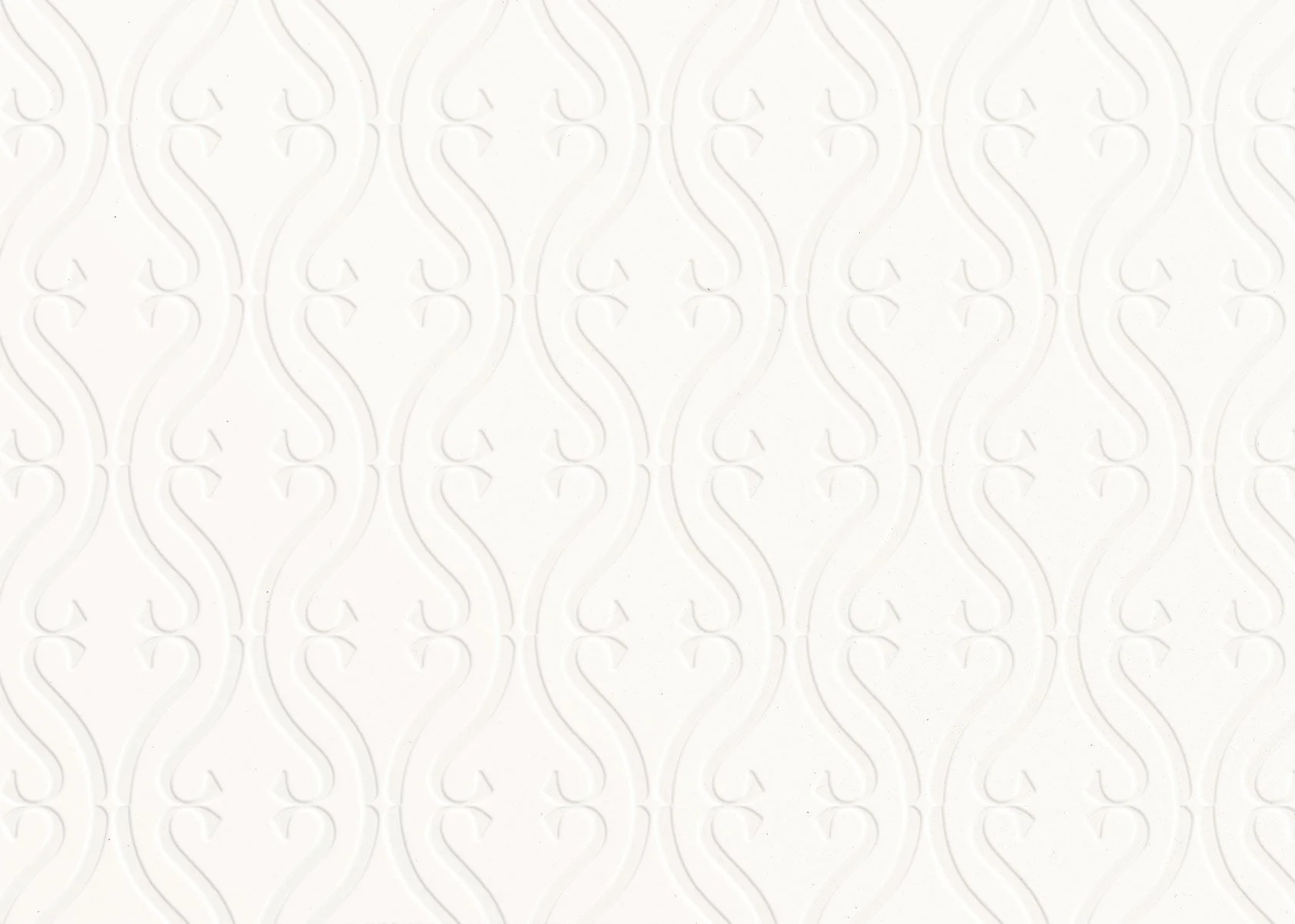
Brand Pattern
An abstract, flowing motif inspired by:
sculpting hand movements
facial contours
ritual repetition
This becomes a signature visual asset that reinforces the concept of transformation and flow.
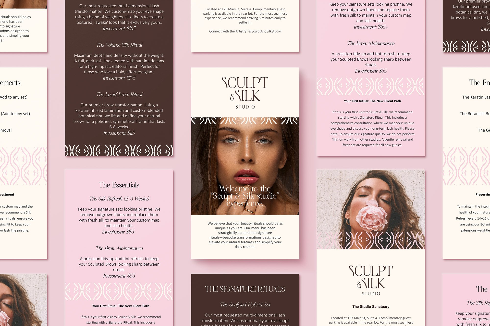
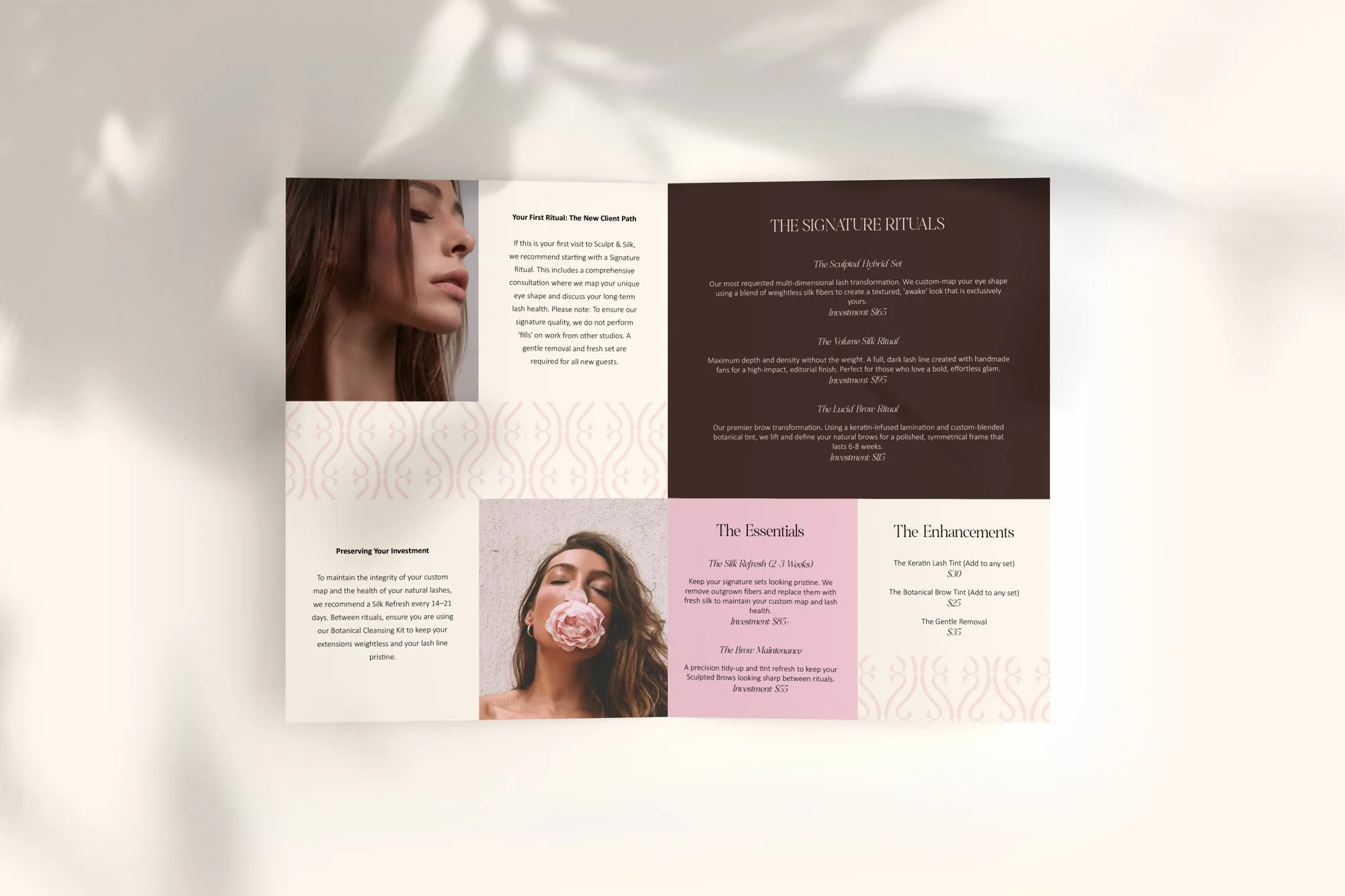
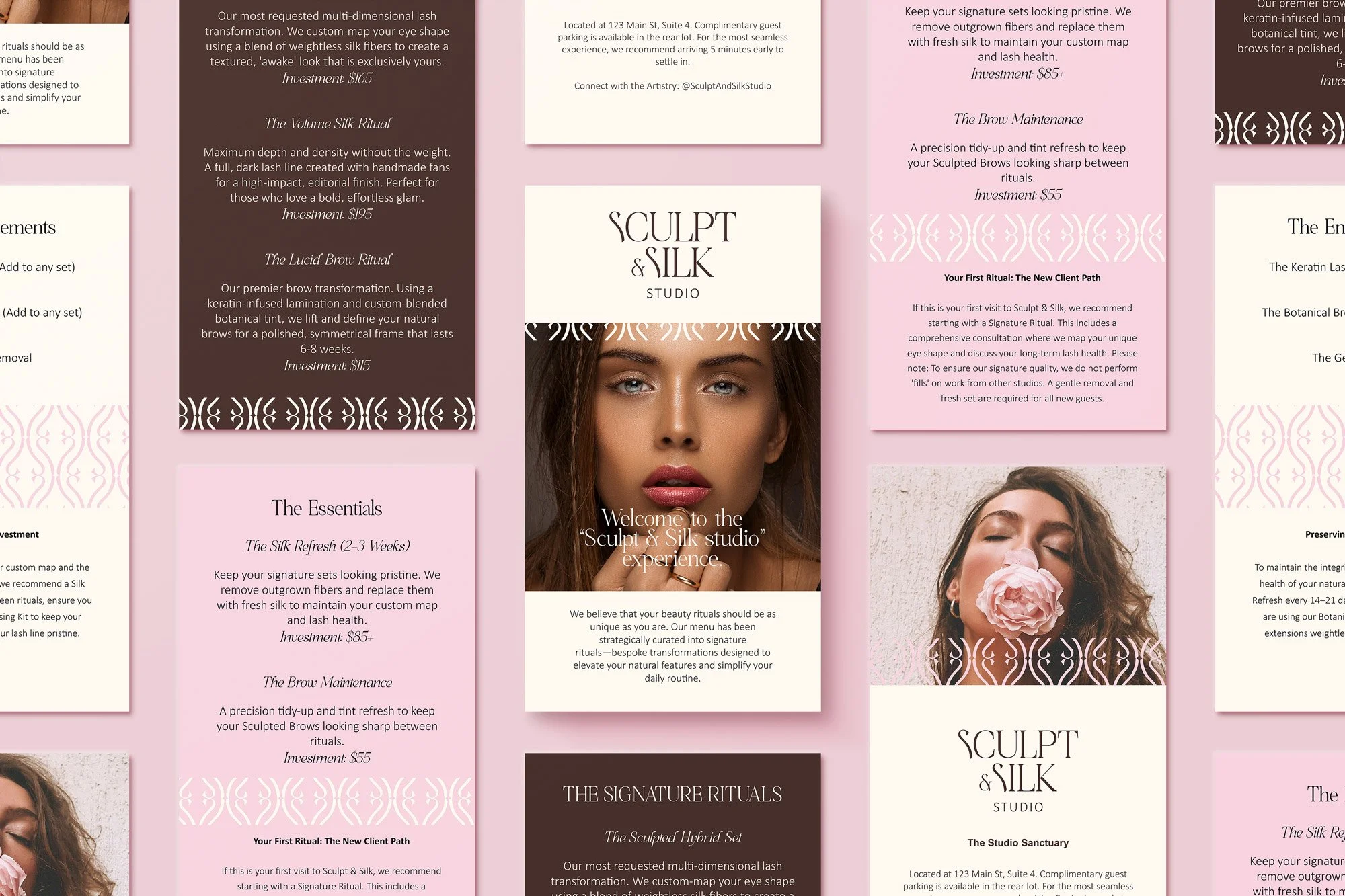
THE SIGNATURE MENU
Instead of a traditional service list, the menu was redesigned as a guided brand experience.
The Highlight: “The Signature Rituals”
Positioned as the core offering, this section:
sits at the top of the hierarchy
uses more breathing space and contrast
is written with intention and clarity
Each ritual feels like:
a named experience
a transformation journey
not just a treatment

Structure Shift
The menu is divided into:
Signature Rituals (hero)
Essentials (maintenance)
Enhancements (add-ons)
This creates:
clear decision-making for clients
natural upsell flow
stronger perceived value
✨ Clients don’t choose from confusion—they choose from clarity.
THE RESULT
Sculpt & Silk now feels like a specialist brand with a clear brand identity, not a general beauty provider.
Transformation:
From: “facials and beauty services”
→ To: signature sculpting ritualsFrom: price-based decisions
→ To: experience-based valueFrom: visually inconsistent
→ To: cohesive, elevated brand system
What This Project Represents
This project reflects my approach to beauty branding:
I don’t just design logos. I help beauty professionals turn their best service into a signature brand experience that attracts higher-paying clients.
Want your brand to feel this elevated and clear?
My 10-Day Signature Beauty Brand intensive is designed to help you launch your premium identity fast.
I take on only 3 Signature Beauty Brand clients each month to keep the process focused, thoughtful, and collaborative.