Voila Skin Studio — Brand Identity
When skin becomes a ritual, the brand has to feel like one too.
A complete brand identity system for Voila Skin Studio — built around flow, warmth, and the quiet confidence of someone who truly knows their skin.
Client: Voila Skin Studio
Industry: Luxury Skin Care Studio
Deliverables: Brand identity, logo system, artwork, brand board
Timeline: 2 weeks
The brief
The skincare market is crowded. Voila needed to be impossible to ignore.
Most skincare studios look the same — clinical whites, sans-serif precision, sterile photography. They signal safety but communicate nothing memorable. Voila Skin Studio came with a different ambition: to be the brand that clients feel before they can explain why they chose it.
The challenge wasn't to create something beautiful. It was to create something that felt inevitable — a visual identity so precisely right for this studio that clients would never question whether they were in the right place.
Strategy & thinkingBefore a single line was drawn, we defined what Voila actually stands for.
Brand identity without strategy is decoration. So before we opened any design tool, we asked the harder questions: Who is the Voila client, really? What does she feel when she walks out of a treatment? What does the brand need to say when she's scrolling at 11pm deciding whether to book?
Three words emerged as the creative brief: flow, warmth, restraint.
Not the clinical authority of a dermatology clinic. Not the bubbly approachability of a high-street beauty bar. Something in between — the quiet confidence of expertise worn lightly.
That became the filter for every decision that followed.
Target audienceShe knows what she wants. She just needs to trust you first.
The Voila client is a woman between 25 and 45. She is urban, deliberate, and informed. She reads ingredient lists. She follows skincare specialists on Instagram, not influencers. She spends on quality and expects every touchpoint — from the logo on a business card to the texture of a package — to confirm she made the right choice.
She doesn't want to be sold to. She wants to be understood.
The brand identity had to speak her language: elevated but not cold, luxurious but not loud, expert but never alienating.
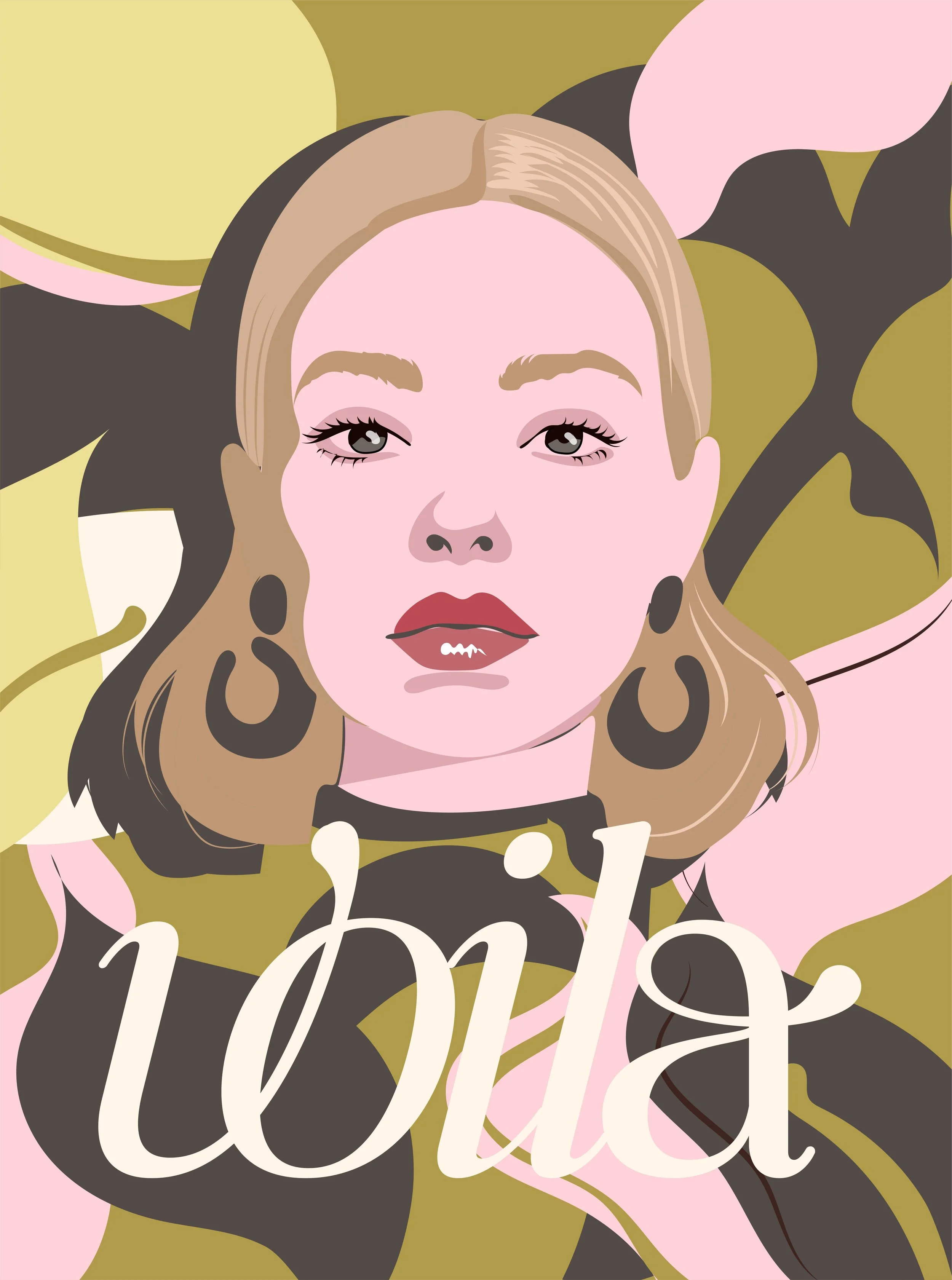
Creative directionA logomark that moves like a signature and lands like a statement.
The Voila wordmark was built around a single insight: the most memorable luxury brands don't just show you what they are — they show you how they move.
The fluid calligraphic script carries the brand name with the ease of a handwritten note and the precision of a master typographer. It is deliberate without being rigid. Confident without being aggressive. The kind of mark that looks as beautiful embossed on a product box as it does at three metres tall on a storefront window. The stacked "Skin Studio" lockup in clean uppercase sans-serif creates a deliberate tension — expression meeting precision — that defines the brand's character across every application.