"Grace in Every Sparkle, Power in Every Piece."
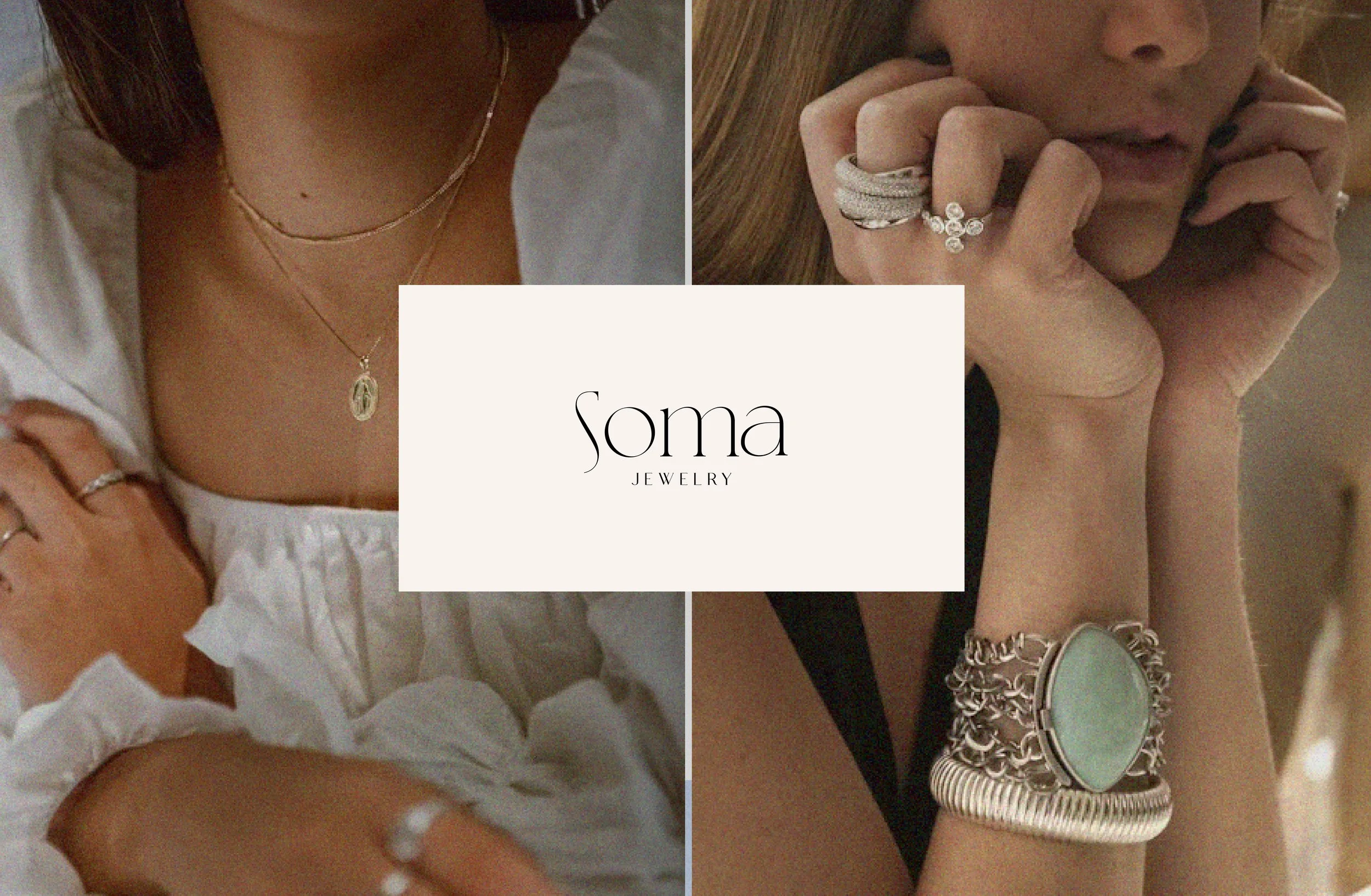
brand identityThe brand design for Soma Jewelry embodies a harmonious blend of natural elegance and contemporary sophistication.
This design ethos communicates the brand’s dedication to empowering women through jewelry that feels personal, luxurious, and effortlessly stylish, making it an ideal choice for those who value grace and individuality.
Brand Words
Timeless, Elegant, Authentic
Grounded in an earth-toned palette, it reflects warmth, authenticity, and a connection to nature, while soft baby blue accents add a touch of serenity and freshness.

The aesthetic is complemented by a clean, modern font with elegant lines, creating a visual identity that is both timeless and minimalistic.


Wanna get in touch?Drop me an email at itsdianadesign@gmail.com
Follow my journey on Instagram @itsdianadesign


