Soft Curves, Deep Calm
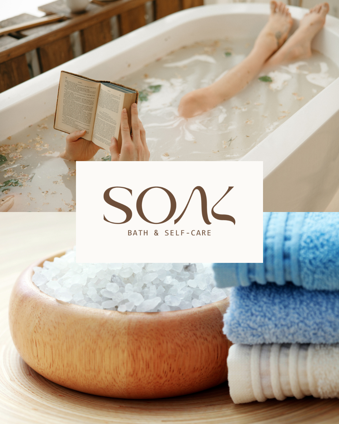
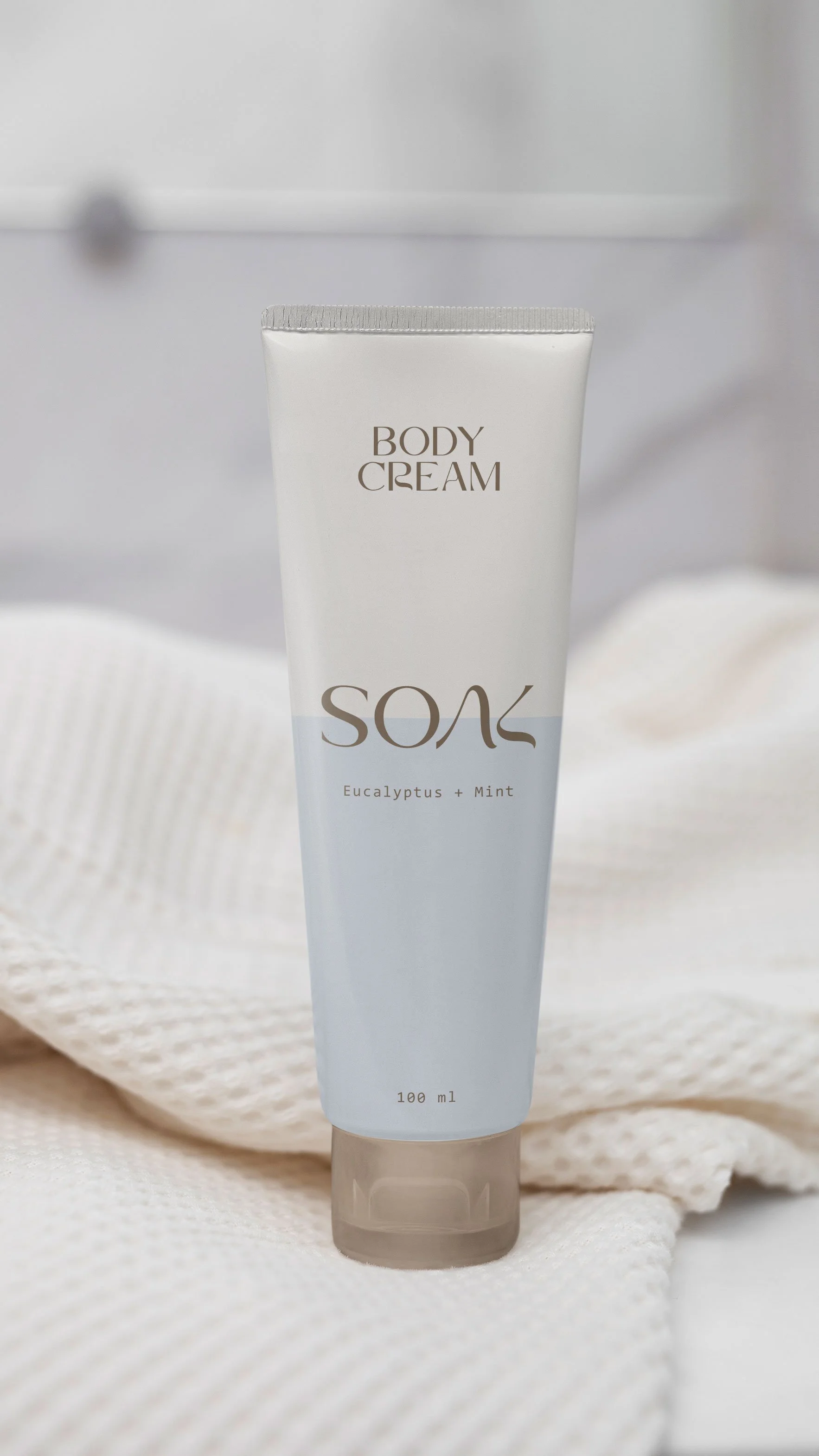
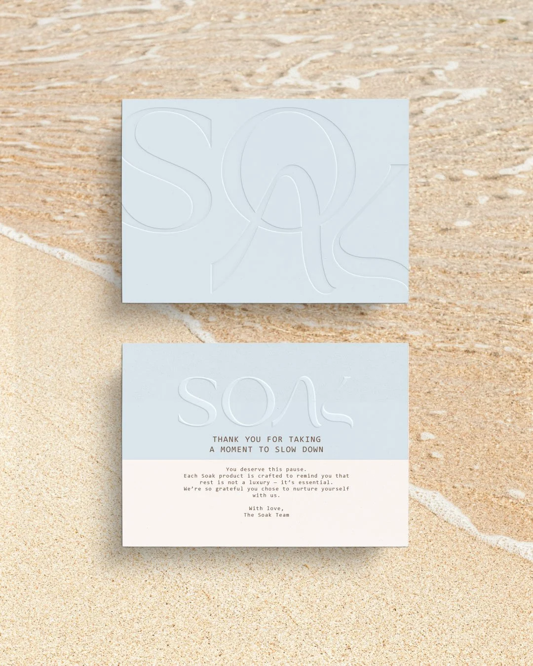
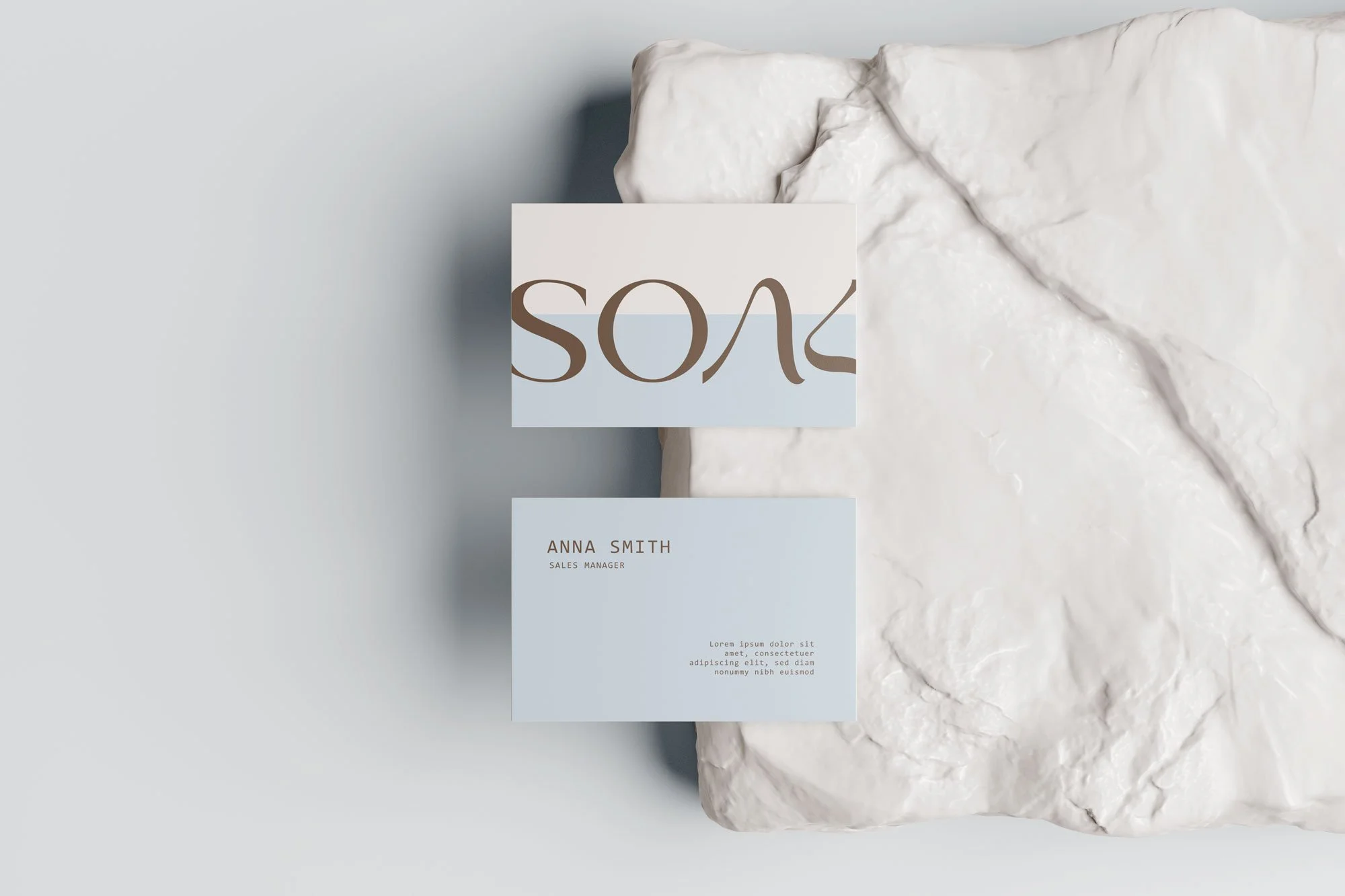
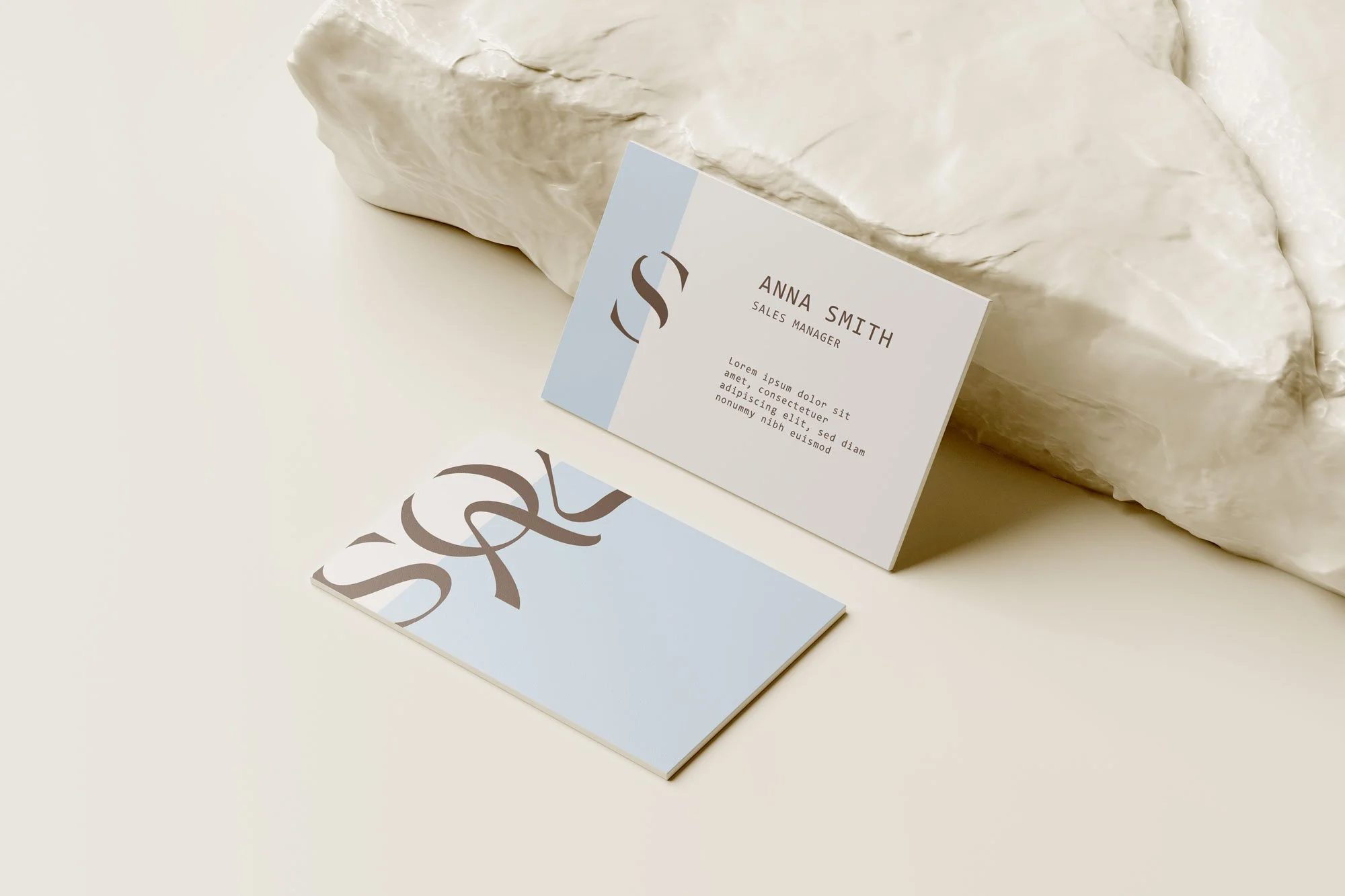
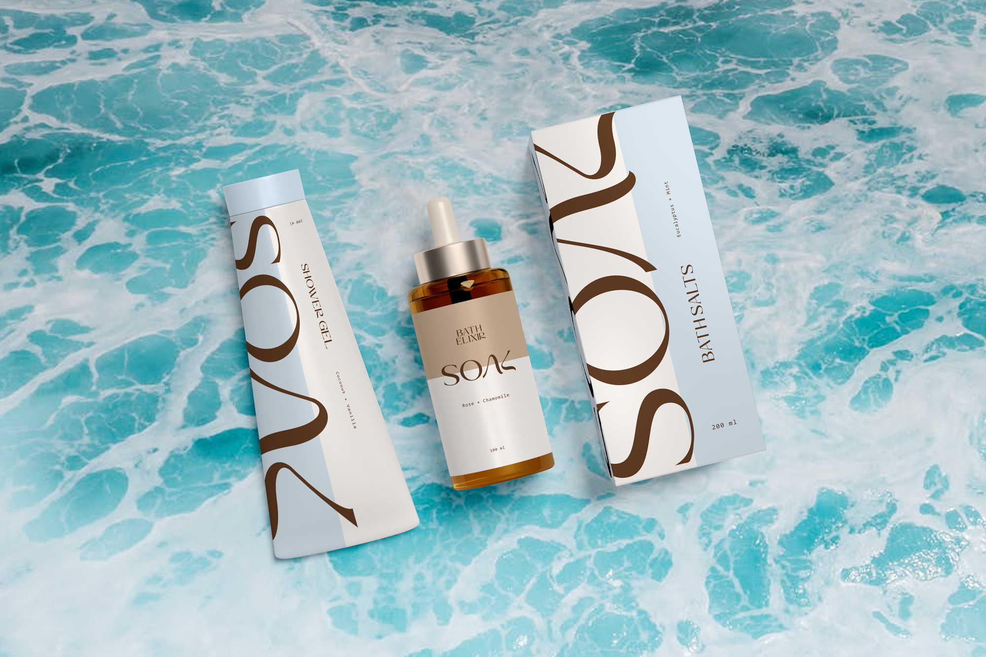
BRAND IDENTITYSOAK is a bath salt brand centered on calm, restoration, and quiet luxury. The visual identity combines soft organic letterforms with earthy, muted tones to evoke the feeling of slowing down and immersing in a peaceful ritual. The logo’s flowing shapes subtly resemble water movement and natural curves, reinforcing the sensory experience of a relaxing bath. Overall, the branding communicates a refined yet approachable wellness product that encourages moments of pause and self-care in everyday life.
MISSION
SOAK’s mission is to transform simple bathing into a mindful ritual of restoration. The brand aims to help people disconnect from daily stress and reconnect with their senses through thoughtfully crafted bath salt products. SOAK encourages individuals to create intentional moments of relaxation, promoting both physical comfort and mental clarity.
TARGET
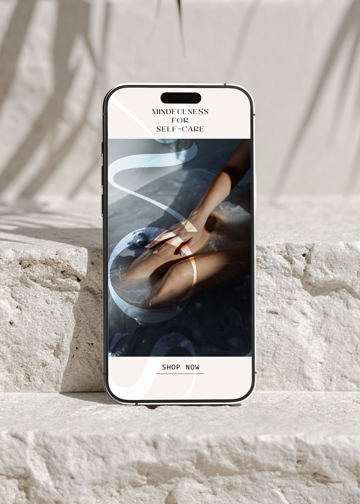
The brand is designed for wellness-conscious consumers who value self-care, relaxation, and aesthetically pleasing products. This includes individuals who enjoy spa-like experiences at home, particularly young professionals and adults seeking ways to unwind after busy routines. The minimal and elegant branding also appeals to customers who appreciate premium lifestyle products.
PERSONALITY
SOAK’s personality is calm, elegant, and nurturing. It feels gentle and thoughtful rather than loud or energetic. The brand communicates quiet confidence and warmth, inviting users to slow down and indulge in restorative moments. Its tone is soothing, natural, and refined—like a peaceful spa atmosphere translated into a visual identity.
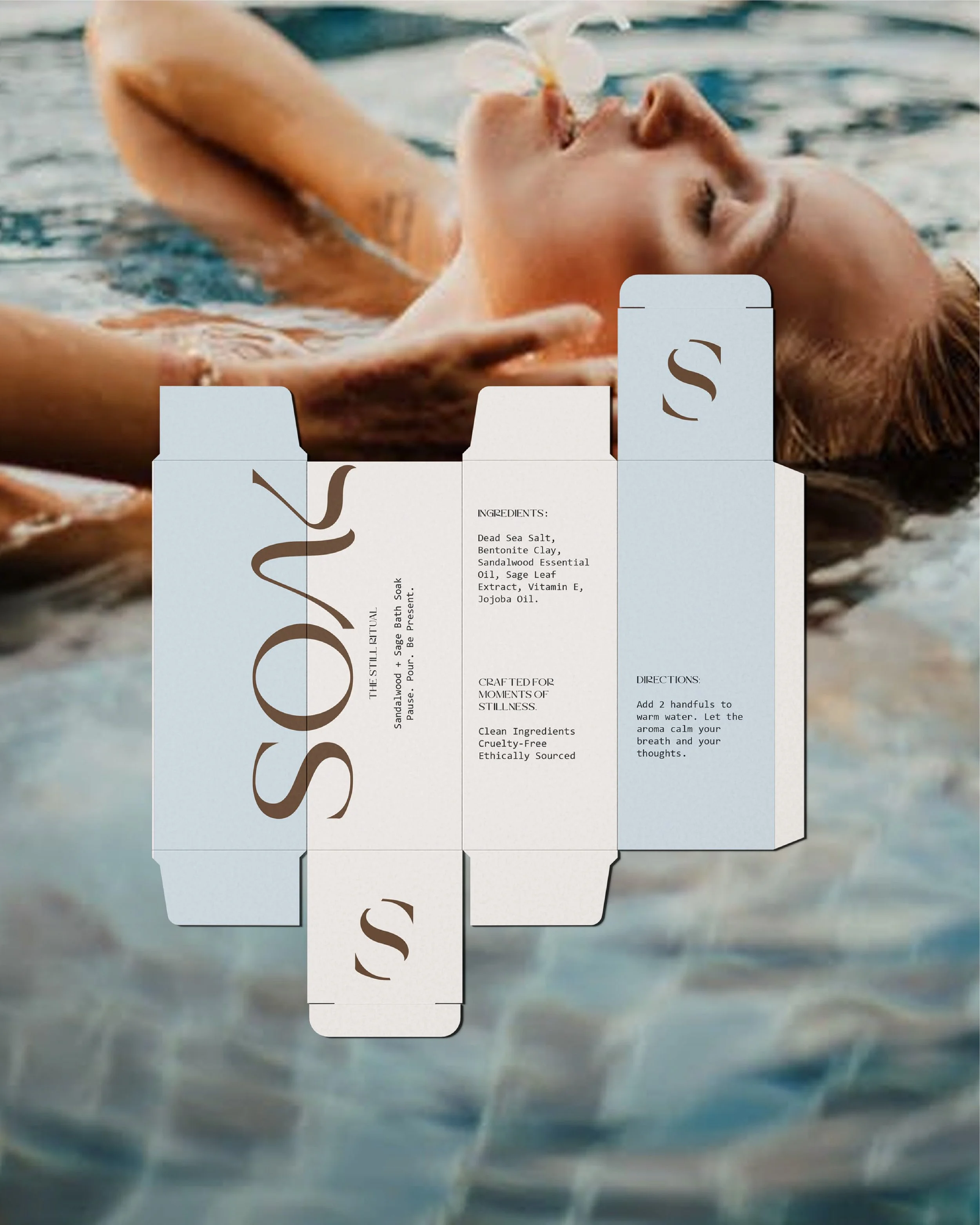
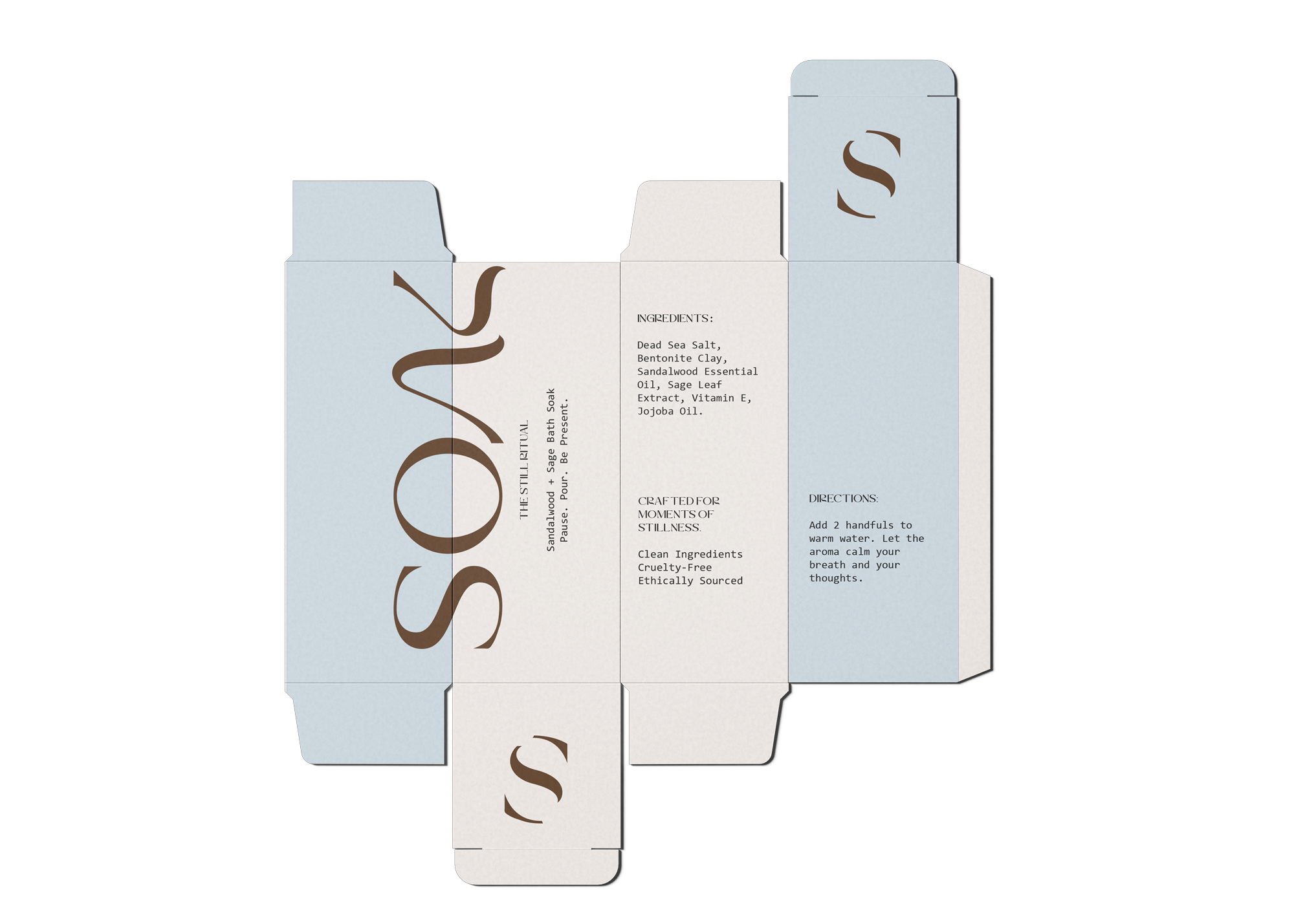
Logo Design & Typography
The typography features elegant, flowing serif letterforms with soft curves and elongated strokes.
These shapes give the brand a natural, fluid appearance that visually echoes the movement of water and dissolving bath salts.
The custom styling—particularly in the “S” and “A”—creates a distinctive, memorable mark while maintaining readability.
The type balances sophistication with softness, positioning the brand as both premium and calming rather than clinical or overly modern.
Color Palette
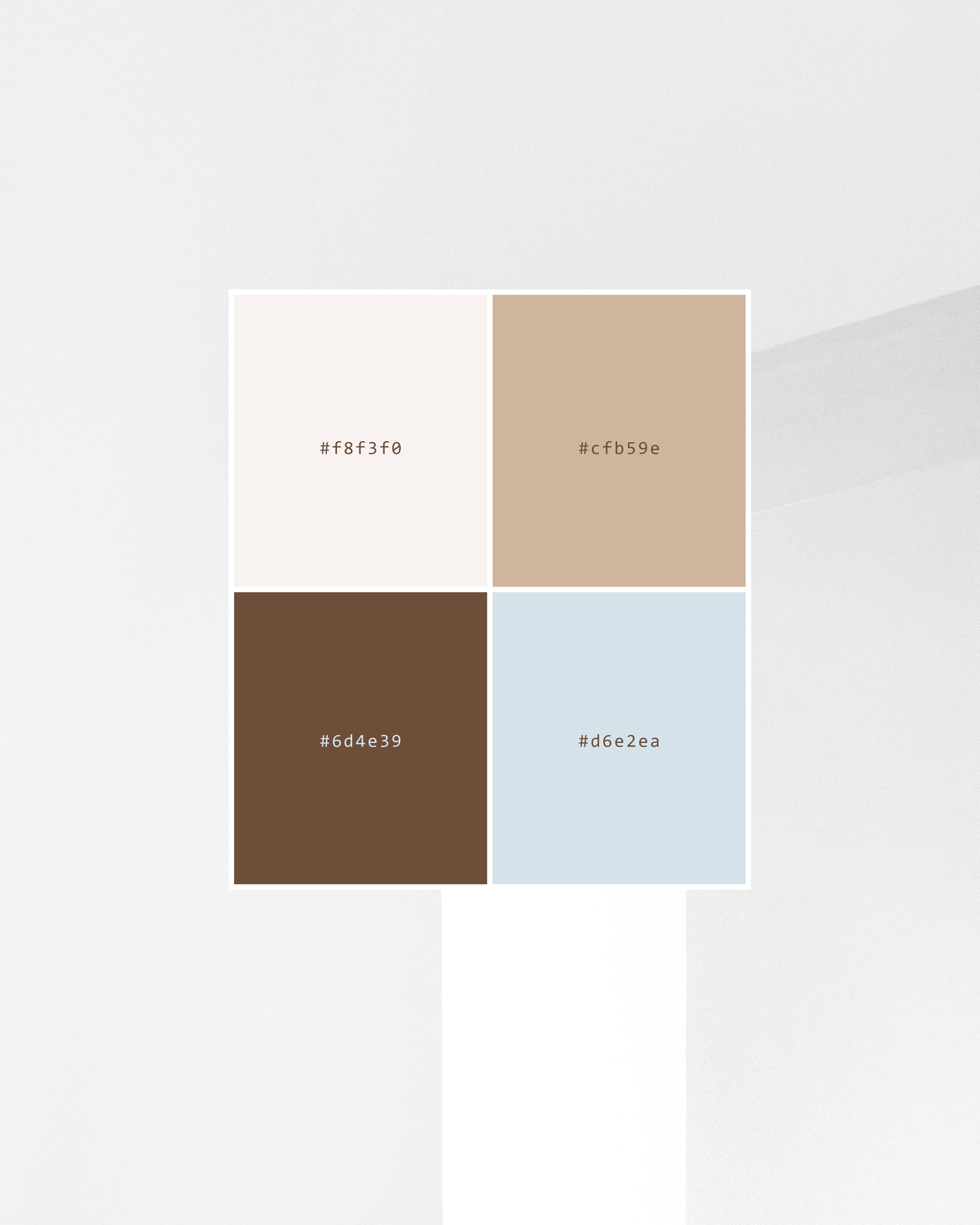
The palette is composed of muted, nature-inspired tones such as warm sand beige, earthy brown, soft clay, and a calming blue-gray. These colors reflect natural materials often associated with bath and spa experiences—stone, earth, water, and minerals. The subdued saturation reinforces relaxation and tranquility, while the contrast between light neutrals and deeper earthy shades creates visual balance and elegance. Together, the palette supports a serene, grounded aesthetic that aligns with wellness and self-care..