SCULPT & SILK
A 10-Day Signature Beauty Brand designed to position Sculpt & Silk as a premium, results-driven studio built around exclusive treatment rituals.
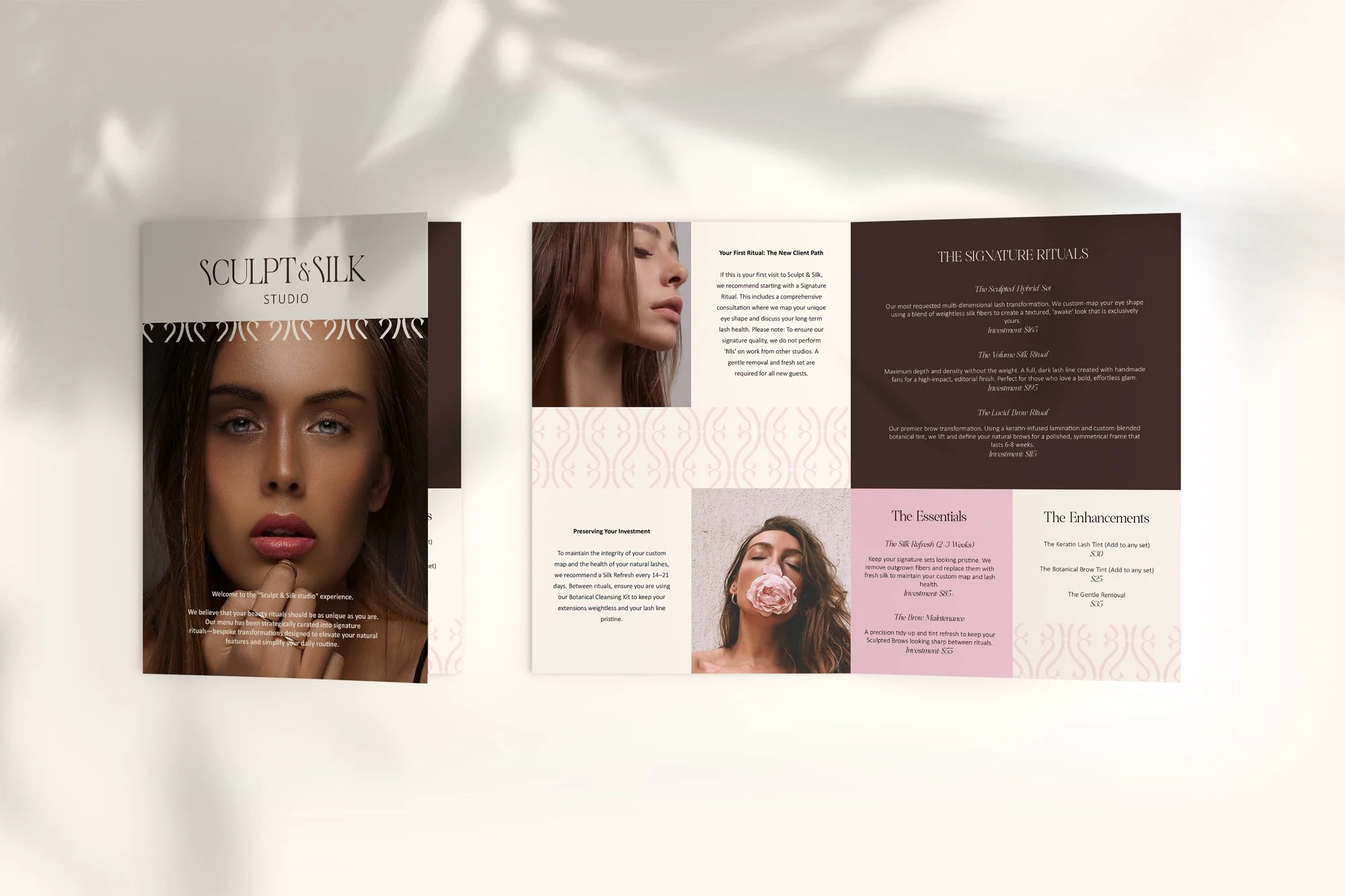
“The Signature Rituals”
This reframed the services from basic treatments into:
intentional
exclusive
experience-driven
higher-value
Rather than selling services, Sculpt & Silk now sells rituals with a result and identity.
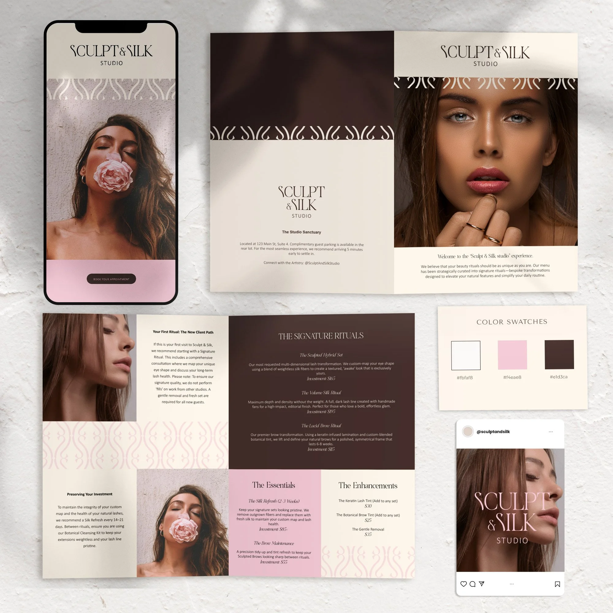
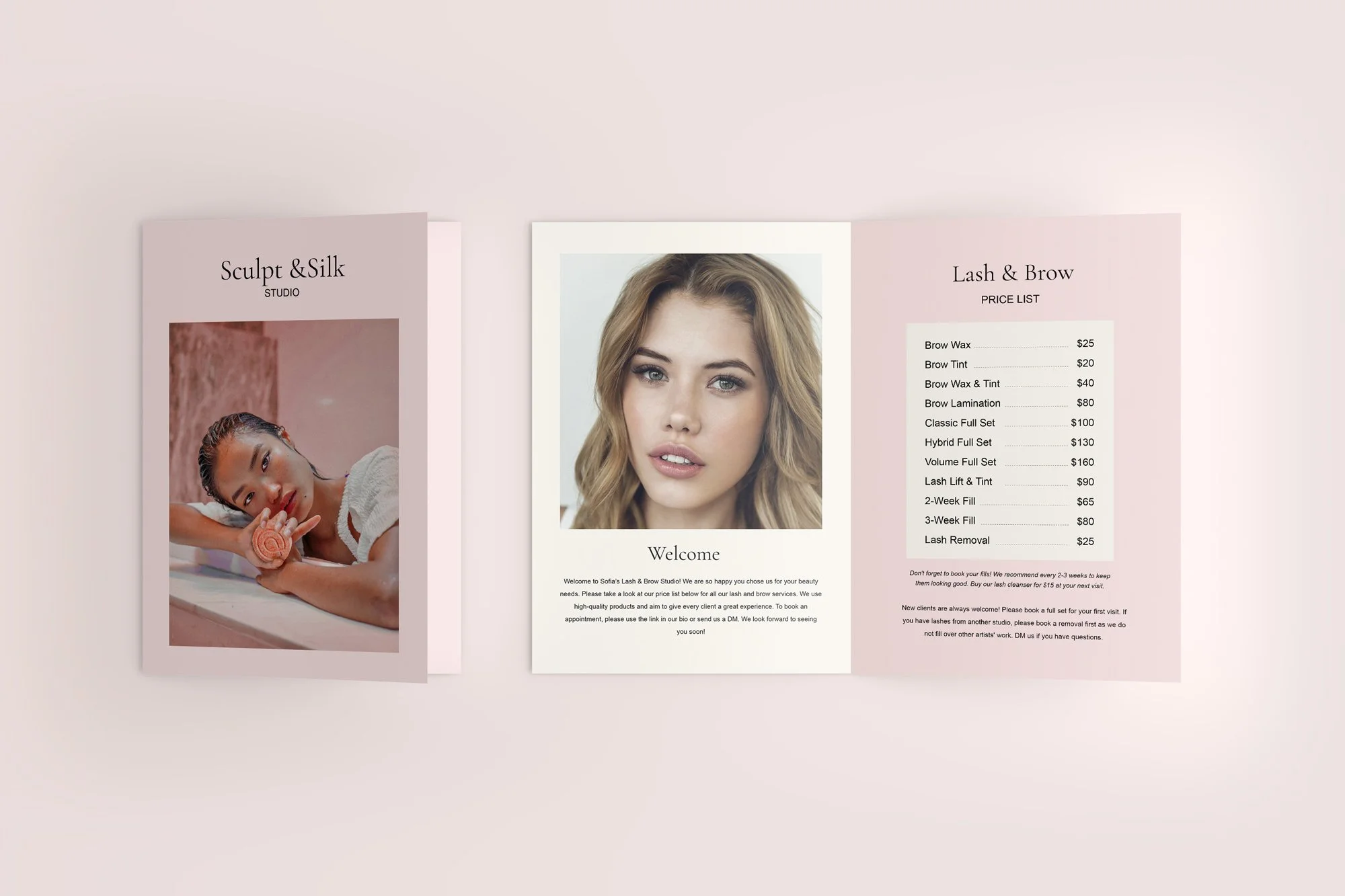
Before
after
From General Beauty Studio to Signature Ritual Experience
The Problem
Sculpt & Silk had the skill and the aesthetic—but the brand didn’t reflect the level of experience being offered.
The services felt generic and interchangeable
The menu read like a standard price list, not a curated experience
There was no clear hero service to anchor the brand
The visual identity didn’t communicate premium positioning
As a result, the brand blended in—and attracted the wrong type of client.
The Strategy
Instead of branding the business as “another beauty studio,” the goal was to elevate it into a ritual-based experience brand.
The key shift:
We built the brand around a Signature Service Category: