ESOL - Skin Care Branding Case Study

BRAND IDENTITYÉSOL is a skincare brand rooted in purity, balance, and intention.
They believe in simple rituals that nurture the skin and calm the mind — powered by clean ingredients and guided by mindful design.
ÉSOL embodies a brand built on clarity and calm — a visual and verbal identity that mirrors the purity of its formulations.
Every element, from tone to texture, was designed to express effortless confidence and mindful beauty.
MISSION
Their mission is to simplify skincare through clean, conscious, and effective formulations that nurture both skin and self.
ÉSOL’s mission is to transform daily routines into mindful rituals — where design, science, and nature meet in harmony.
TARGET
Modern, self-aware individuals who value quality, transparency, and aesthetics. They seek skincare that feels effortless yet intentional — products that align with their minimalist lifestyle, ethical values, and desire for balance and calm.
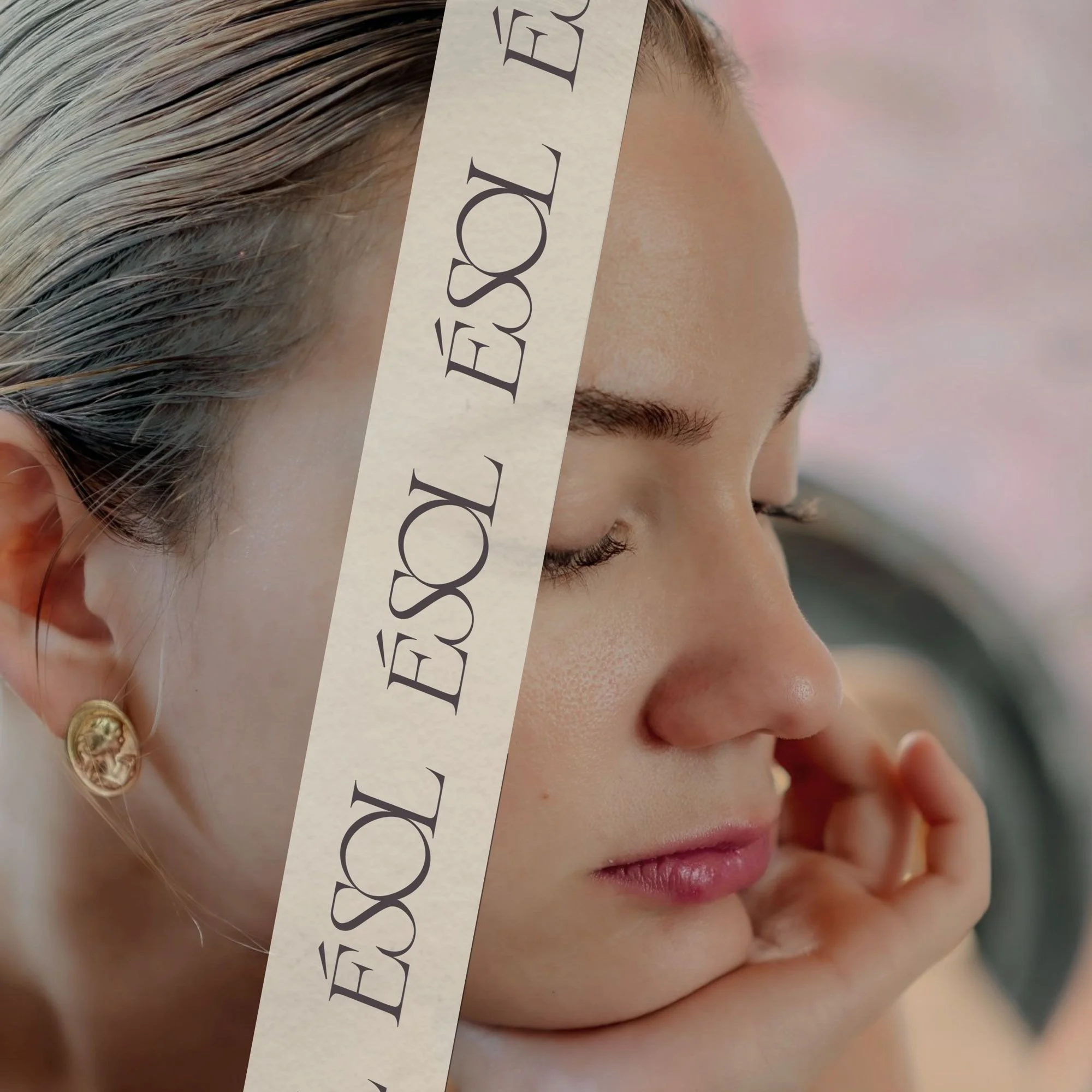
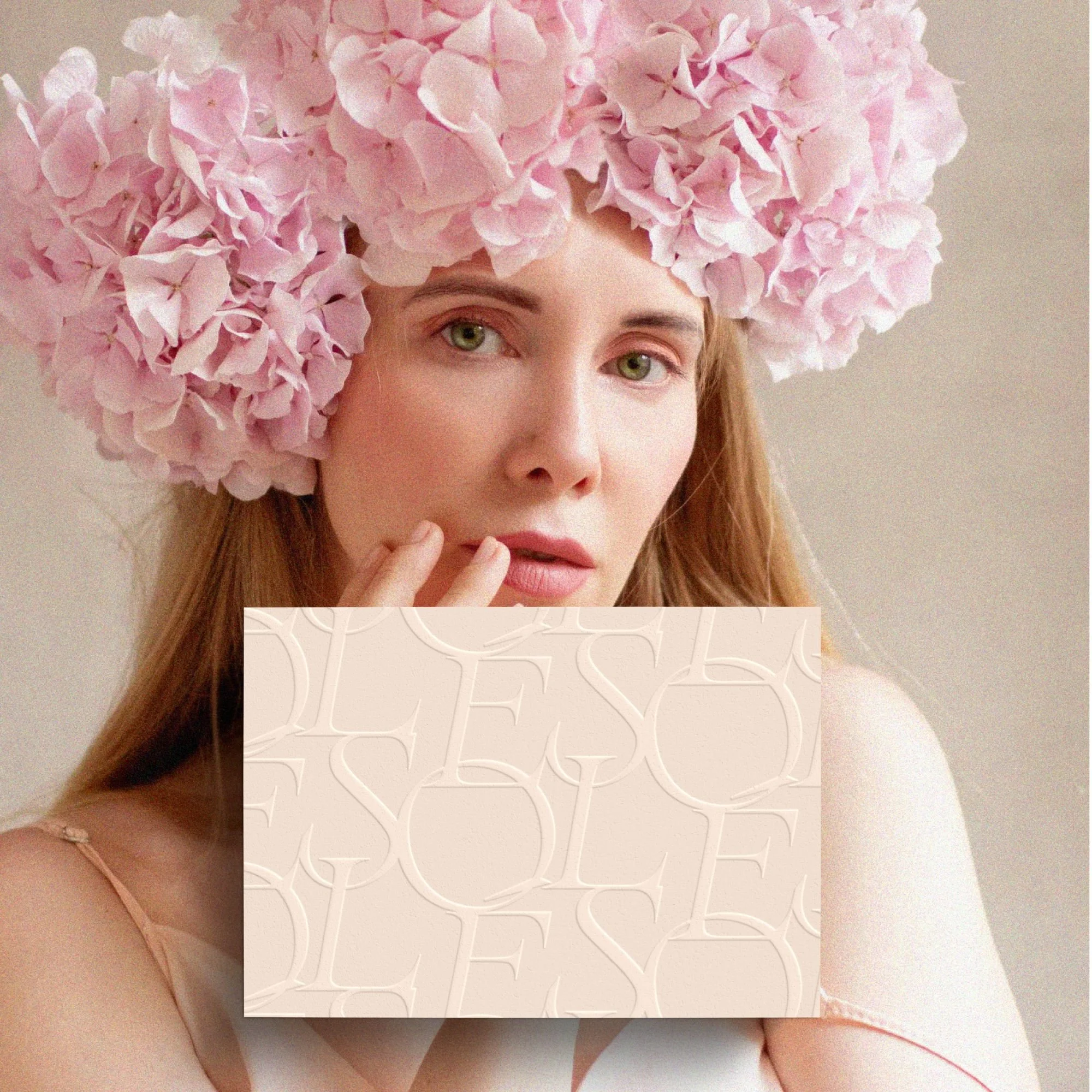
PERSONALITY
Calm, refined, and authentic. ÉSOL embodies quiet confidence — a soothing presence that blends modern elegance with natural simplicity. The tone is warm yet minimal, inspiring trust through honesty, clarity, and care.
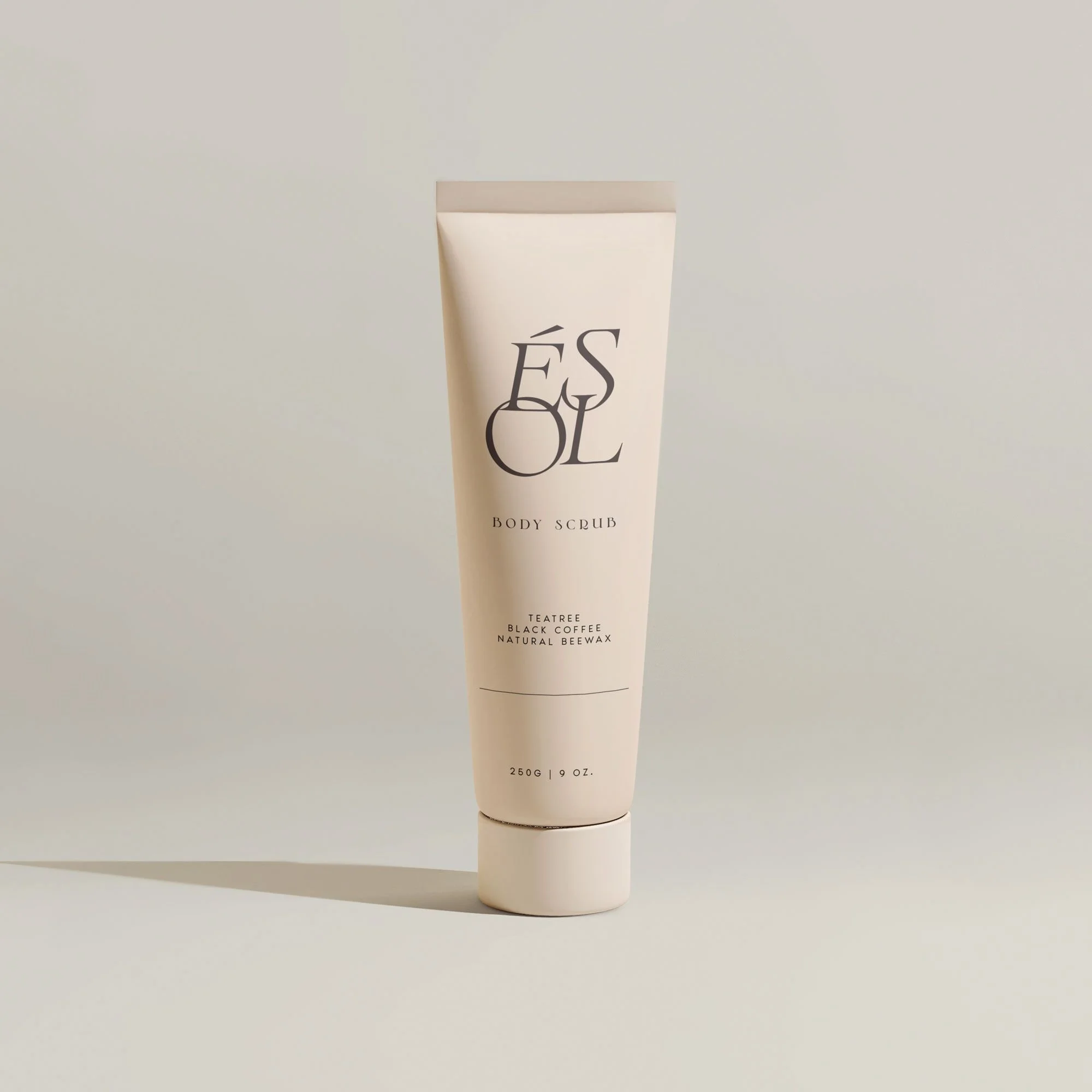
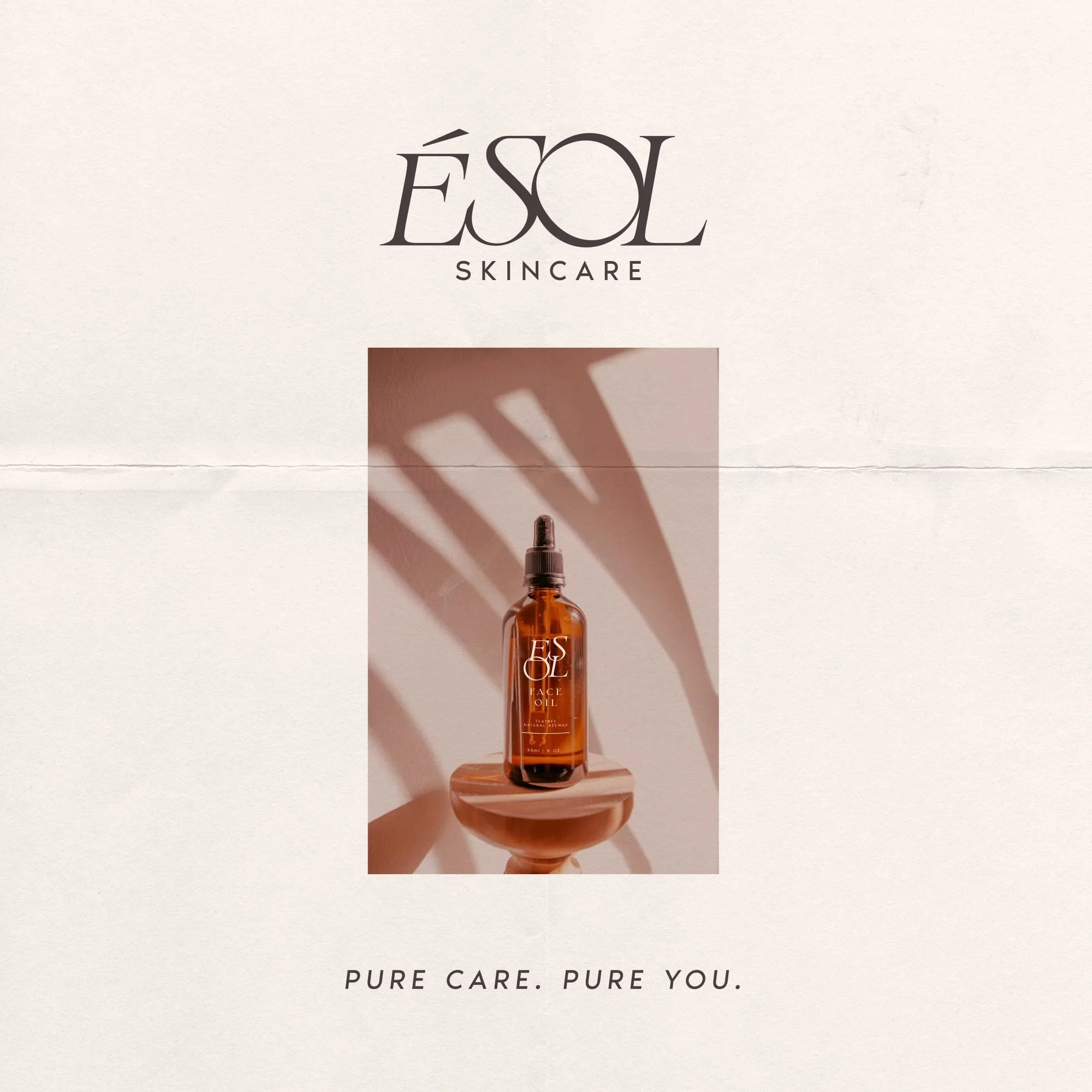
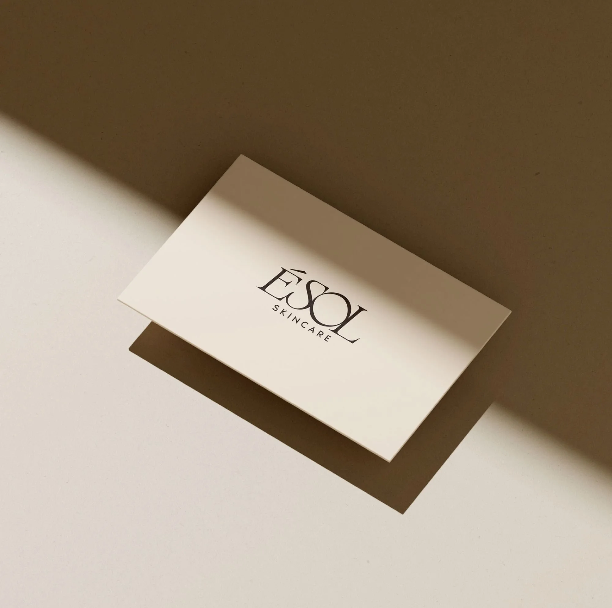
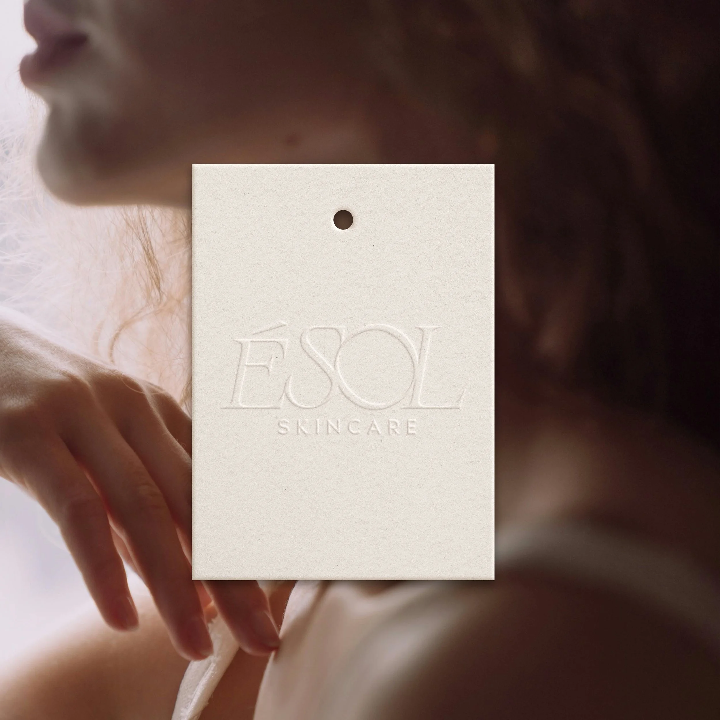
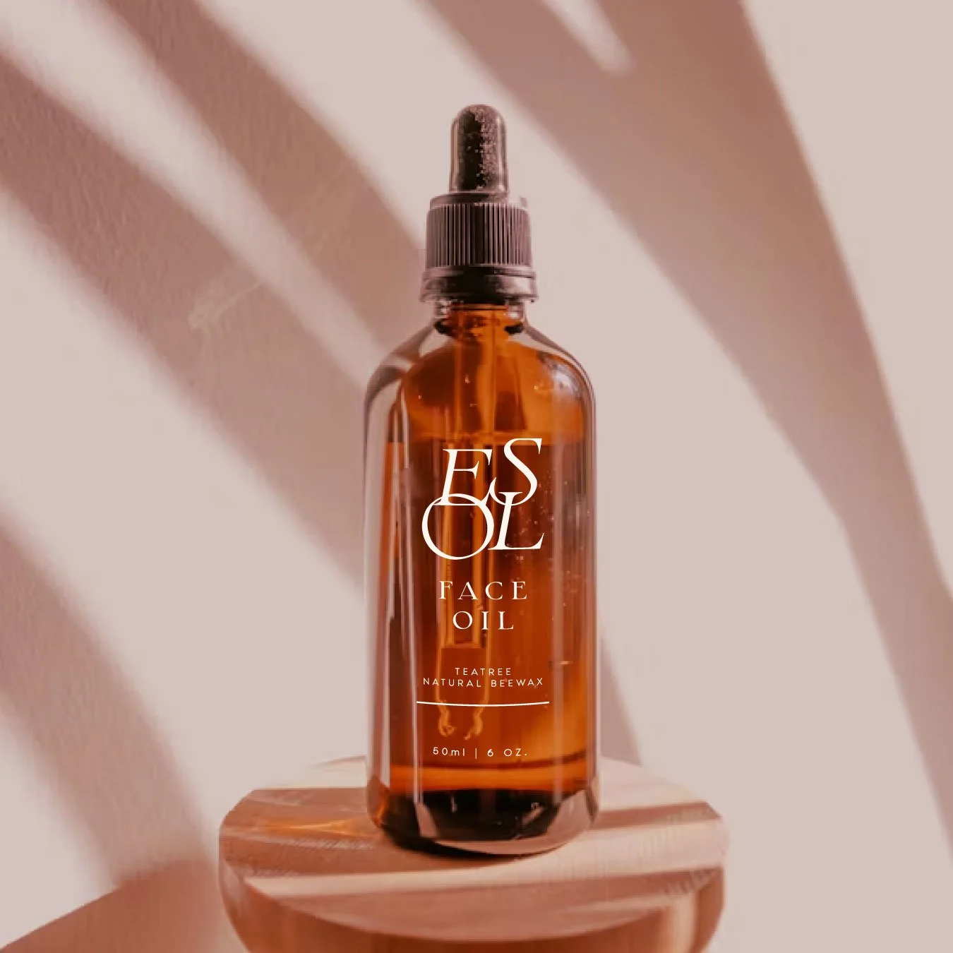
Logo Design & Typography

The typographic choice — an elegant serif with soft curves and subtle contrast — communicates timeless beauty and trust. The delicate accent on the “É” adds a distinctive character, evoking a sense of European refinement and purity, while the balanced spacing and flowing ligatures create a graceful, calming rhythm.
The ÉSOL identity connects with clients seeking serenity, authenticity, and self-care. It feels luxurious yet grounded — a visual embodiment of calm confidence, natural elegance, and the beauty of simplicity.
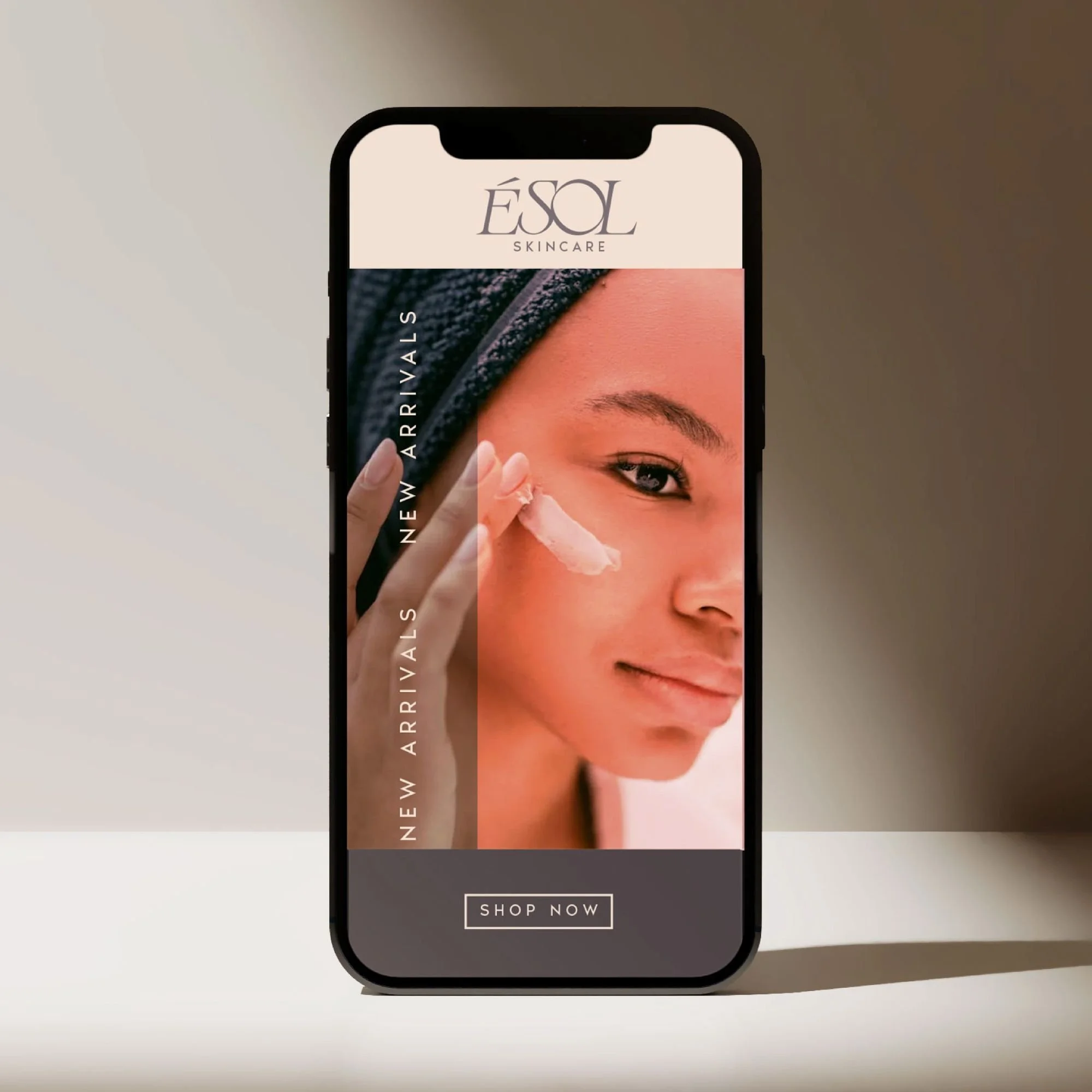
Color Palette

Earthy warmth and soft neutrals, designed to evoke calm, trust, and authenticity.
The palette builds an emotional bridge between nature and nurture. It feels rooted in the earth yet elevated in tone—helping clients feel calm, cared for, and confident.