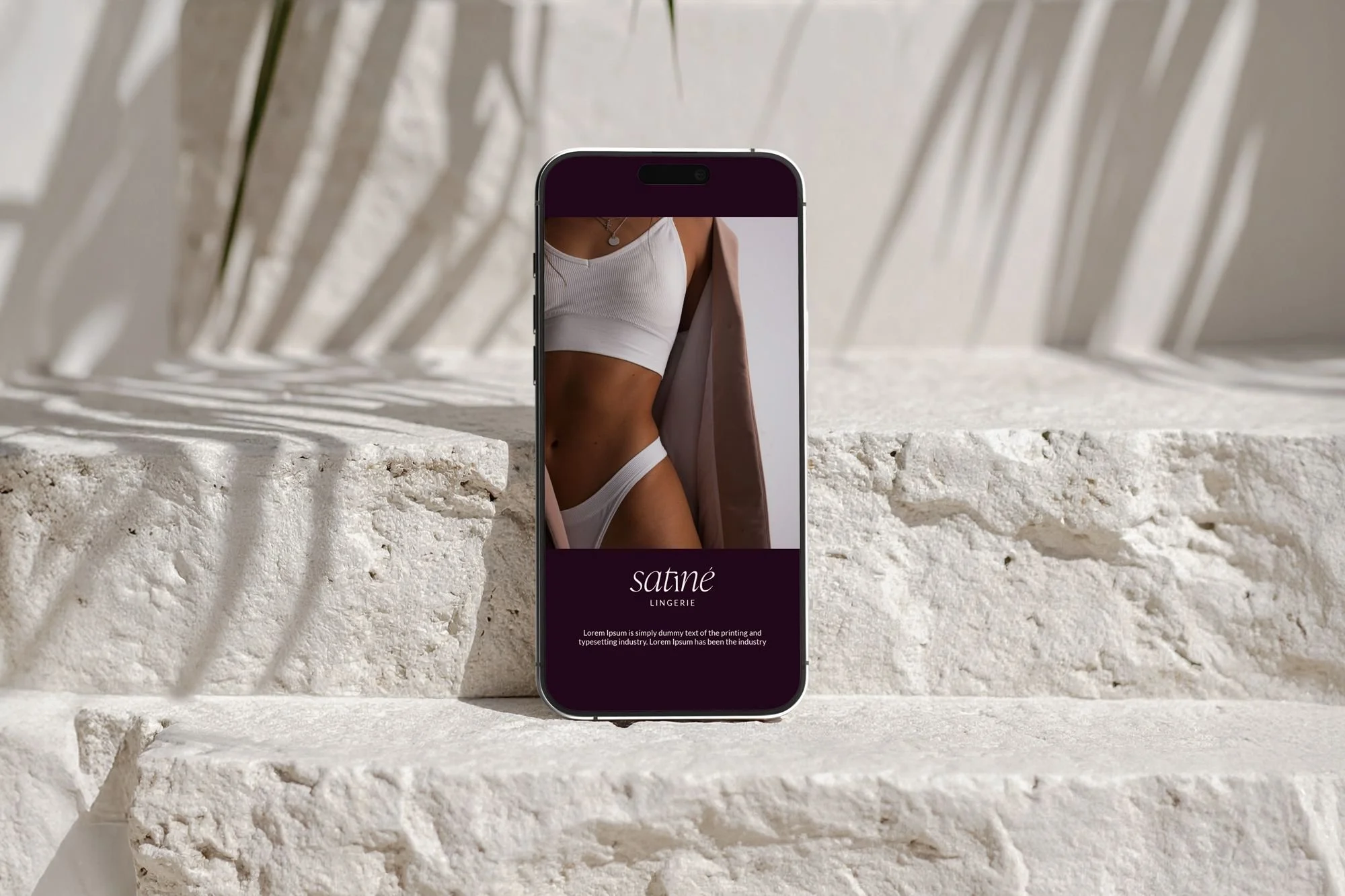
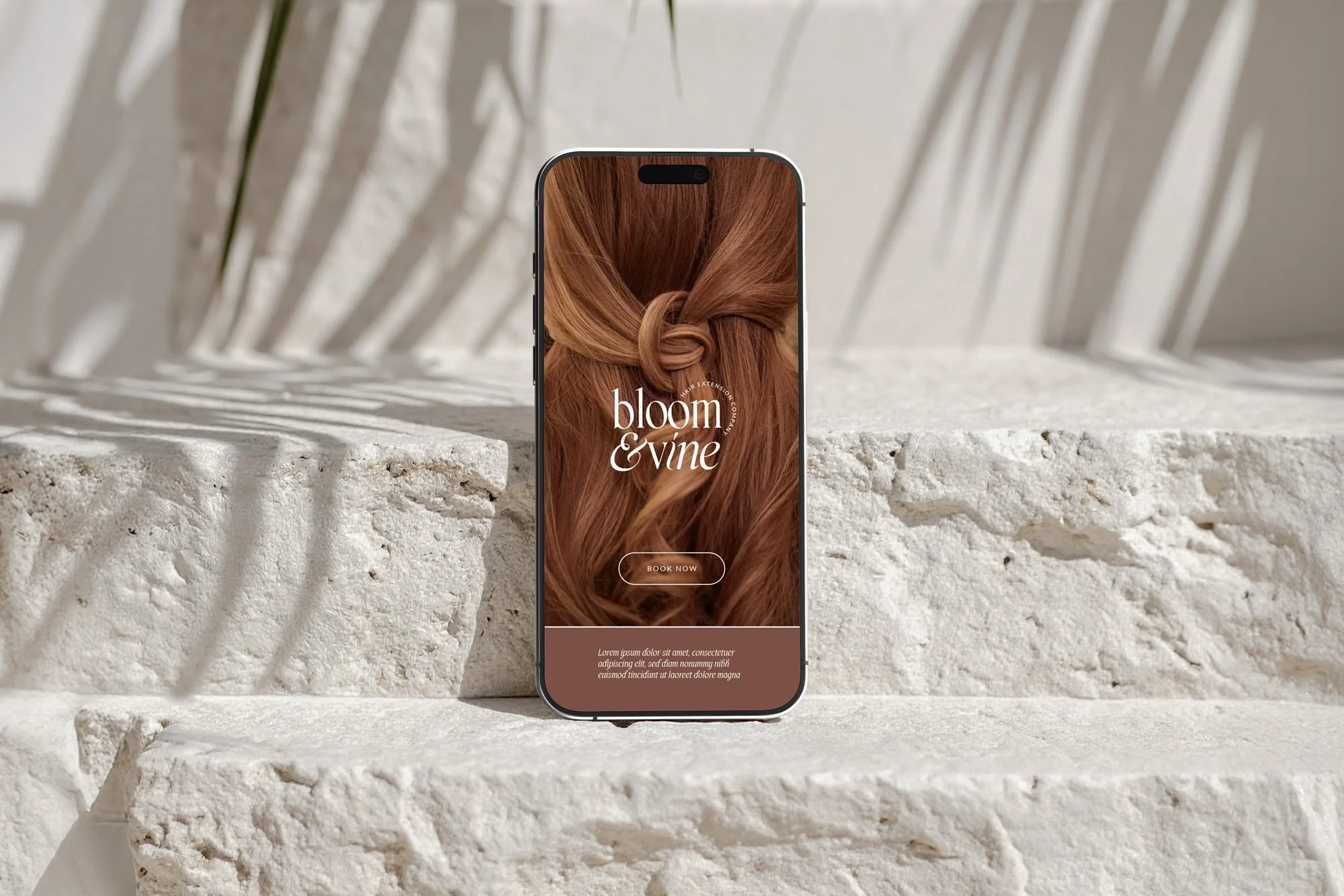
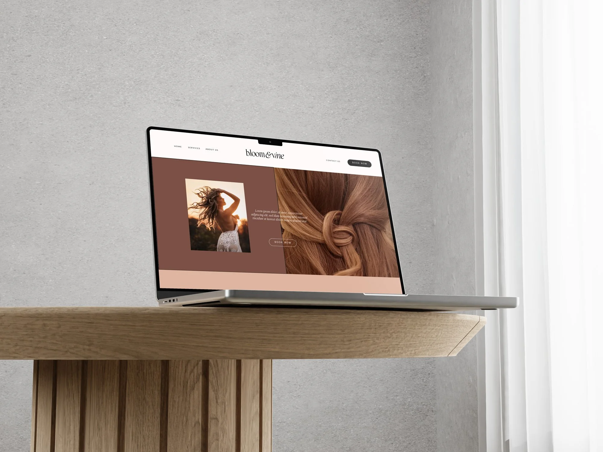
Bloom and Wine Hair Extension Branding
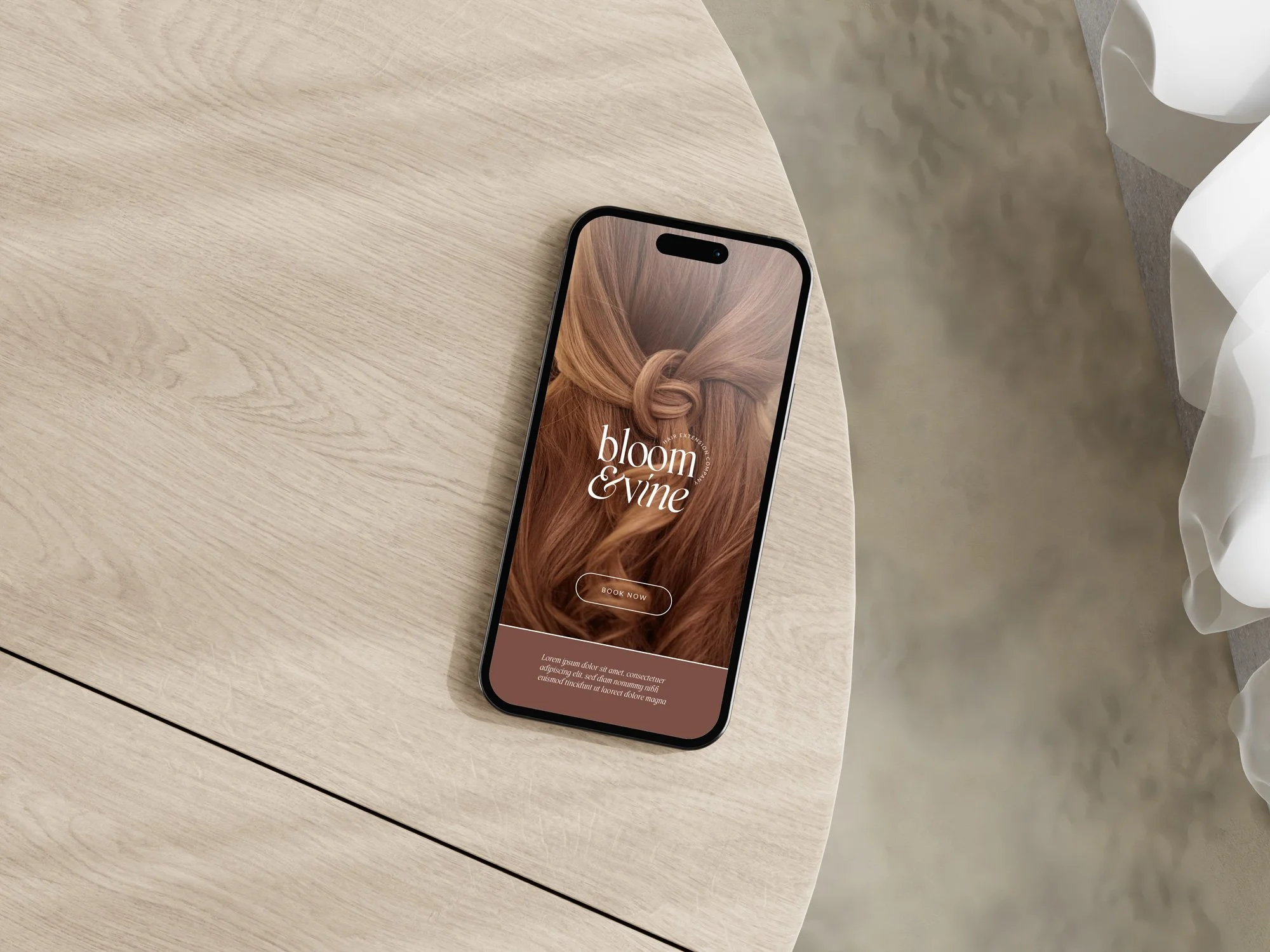
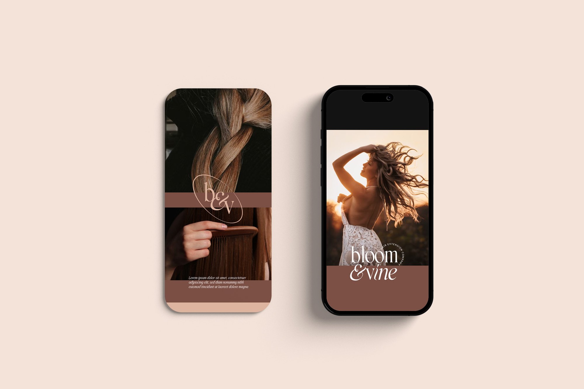
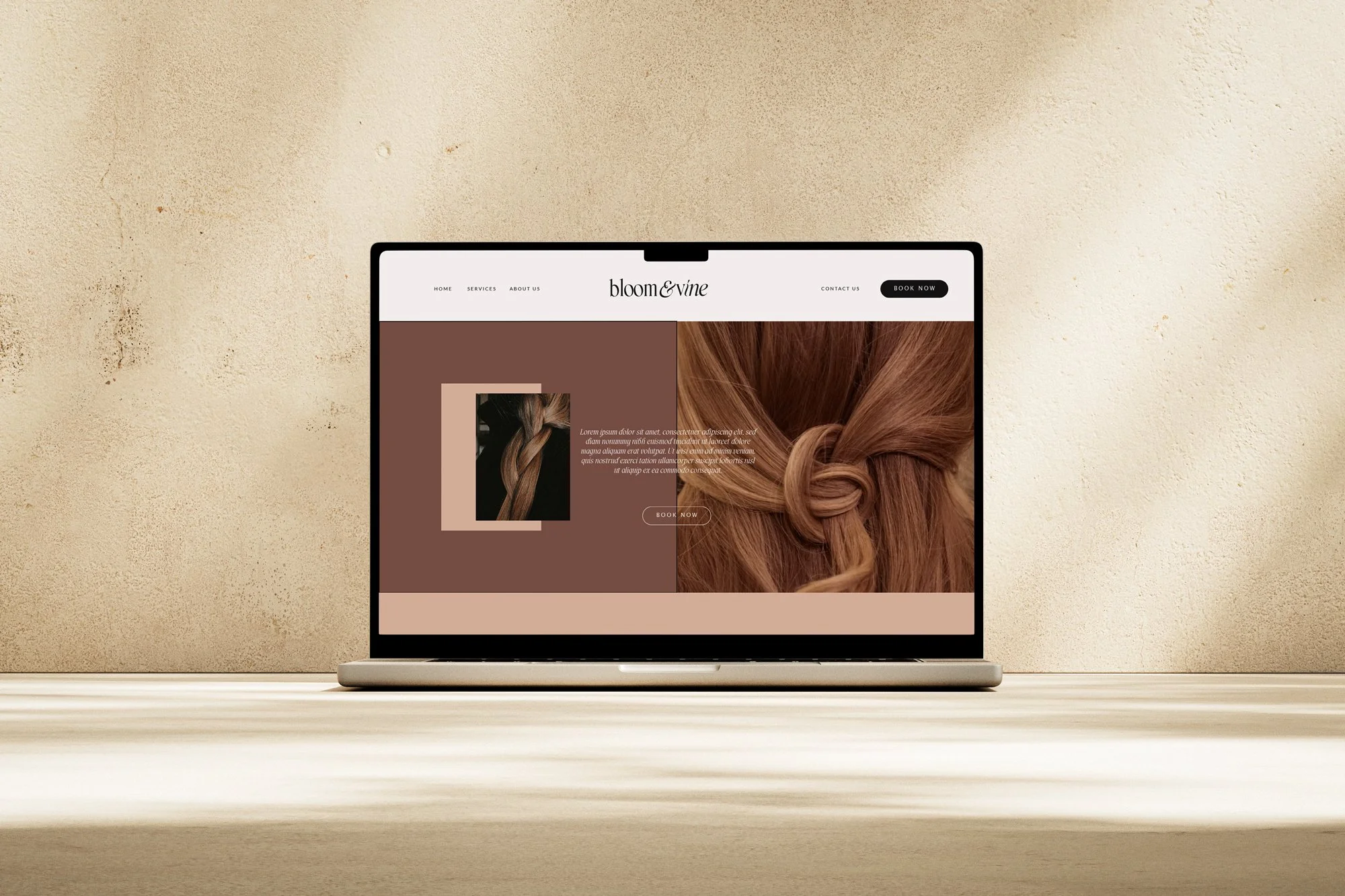
This brand identity was created to embody confidence, warmth, and elevated femininity—perfectly suited for a modern hair extension brand that empowers women to feel bold and beautiful.
The color palette blends rich, warm tones that evoke strength, sophistication, and undeniable allure—striking yet inviting. Paired with an elegant serif typeface and subtle italic accents, the typography adds a touch of softness and luxury to balance the boldness.
This visual direction captures the essence of the brand: empowered, glamorous, and unapologetically confident—just like the women it serves.
MISSION
Their mission is simple — to help you feel beautiful, confident, and completely yourself. They create high-quality, natural-looking hair extensions that blend seamlessly and bring your dream hair to life.
TARGET
Bloom & Vine is made for women who love effortless, everyday beauty. You value products that look and feel natural, fit into your routine, and help you show up as your best self.
PERSONALITY
Bloom & Vine is warm, approachable, and full of positive energy. The brand feels like your stylish, supportive friend. Every detail, from the logos to the tone of voice is designed to make you feel seen, cared for, and excited about your transformation.


Drop me an email at itsdianadesign@gmail.com
Wanna get in touch?
Follow my journey on Instagram @itsdianadesign